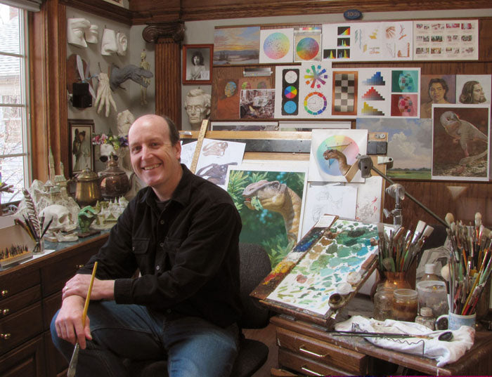
Robh Ruppel's career connects animation, game art direction and observational painting. His work is especially relevant to digital painters who can render individual objects but struggle to make the whole image read. Across very different projects, shape, value and color become tools for deciding what the viewer should notice.
Design before decoration
In a 2005 interview, Ruppel described studying industrial design and illustration at ArtCenter College of Design. His character-design approach began with broad shapes and proportions, then moved toward details. Structure and perspective remained important even when a drawing appeared flat or highly graphic. He also emphasized expression: an interesting outline is only part of making a character feel alive.
His interview about art directing Meet the Robinsons gives a concrete production example. The film's optimistic future used rounded shapes and saturated color, while the present felt more repetitive and confined. These contrasts helped carry the story. He discussed lighting characters with attention to the relationship between a face and its background, drawing on live-action cinematography.
From playable spaces to graphic New York
Ruppel also worked in art direction at Naughty Dog on Uncharted 2: Among Thieves. In an interview with SketchUpArtists, he linked his use of 3D blockouts to industrial-design training: simple models allow an artist to test masses, proportions and curves before committing to a finished image.
His own Into the Spider-Verse portfolio documents concept designs, color scripts, character paintings and style guides. Notes on those images explain the challenge of treating skin and hair graphically within a CG production, and communicating that approach to other departments.
For a concentrated introduction to his environmental painting, Graphic L.A. is a useful starting point. Its publisher describes studies built from simplified shapes and color relationships. The second edition adds further images to this exploration of light, shadow and visual organization.
A study to try
Our study suggestion: paint a familiar street corner using only six large shapes and three value groups. Keep windows, signs and texture out of the first pass. Then add just one high-contrast accent where you want the eye to land. Check the image at thumbnail size. If the scene stops reading, revise the big relationships before restoring detail. The exercise tests your decisions about the picture as a whole, not your ability to reproduce every object.