Moneypenny has a private office overlooking MI6’s operations floor. Q’s workbench has a microscope, a coffee cup and a camera. These are small details, but they explain why the spaces in 007 First Light feel like places where people work.
The September 29 ArtStation Art Blast opens with an account from art directors Rasmus Poulsen and Claudio Della Neve. They describe a team with experience building Hitman locations taking on different demands: driving, car chases and airborne action. Familiarity with detailed environments was a starting point; Bond’s action required new ways of building them.
MI6 puts a hierarchy into the architecture
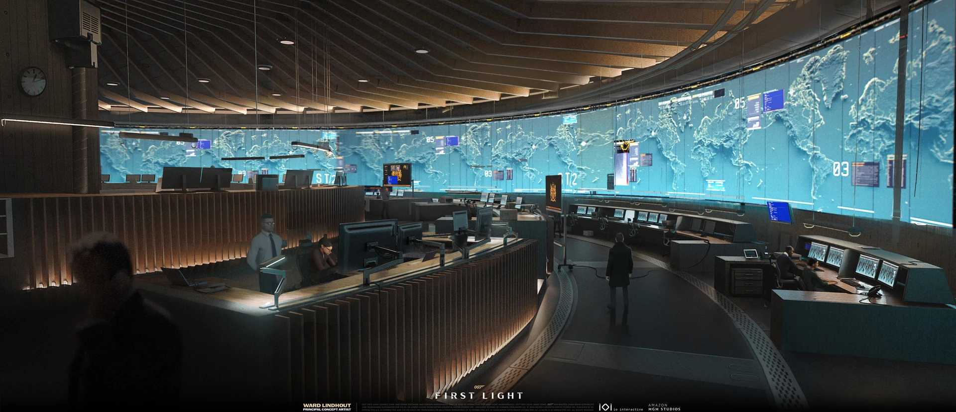
Principal concept artist Ward Lindhout credits the Operations Room as a collaboration with Rasmus Poulsen. He describes it as the place where decisions are made while agents are in the field. Moneypenny’s elevated pod-office overlooks the larger room, giving that relationship a physical form.
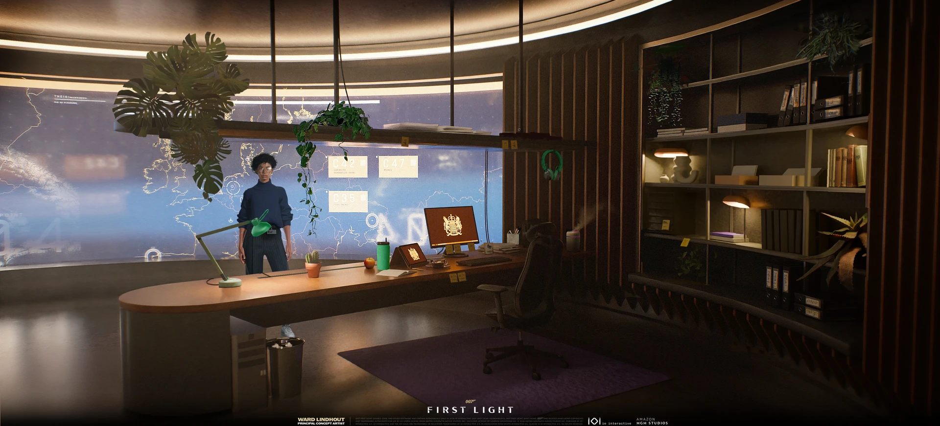
In the concept, curved desks and a continuous map display gather attention towards the centre. The office retains that rounded vocabulary at a smaller scale. Plants, books and a desk lamp introduce the ordinary possessions of an occupant into a highly organised institutional space.
What is useful here for an environment illustrator is the change of scale. An establishing view can communicate an organisation; a closer view needs evidence of an individual. Repeating the architecture while changing the density and kind of objects makes those views feel connected without making them interchangeable.
The important relationship is visible without a floor plan. The operations room has many workstations; the office has a different level of privacy and a view over them. That gives an illustrator a reason to vary scale, enclosure and viewpoint within one location. If every room receives the same broad establishing composition, those differences in authority and daily use can disappear.
The rounded forms also prevent the office from looking imported from another project. A shared shape vocabulary is doing quiet continuity work here. It does not mean every object needs the same curve: books, screens and equipment provide smaller, straighter interruptions. The contrast is what makes the architectural repetition feel deliberate rather than mechanical.
Q Lab works at room scale and desk scale
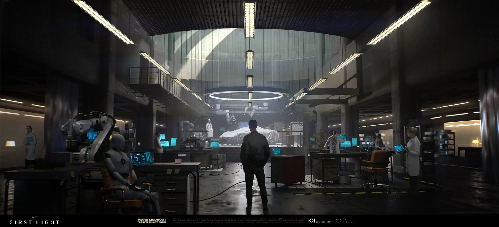
Lindhout’s Q Lab project includes both furniture and architecture. In the wider image, the overhead lighting and central work area make the room readable before the smaller equipment comes into focus. A foreground figure supplies a human measure for the space.
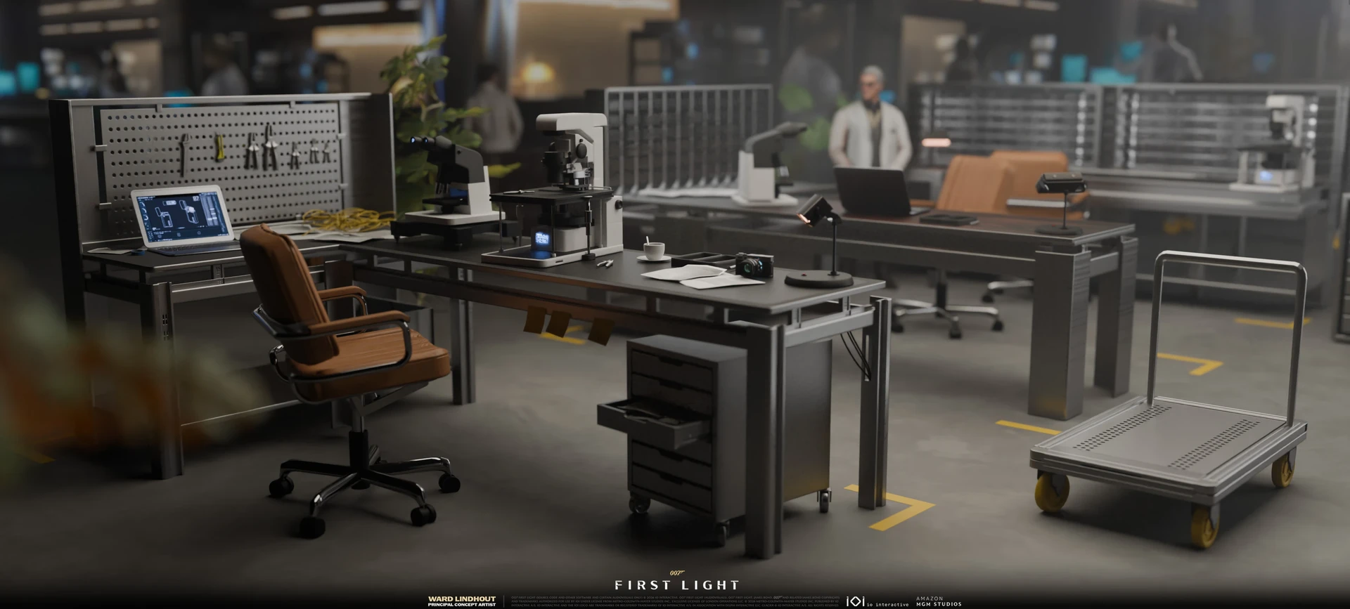
The furniture view changes the emphasis. A leather chair sits beside a hard worktop; tools hang on a perforated panel; a wheeled trolley leaves room for moving equipment. The cup and papers interrupt the laboratory’s order just enough to suggest work in progress. The materials remain restrained, so the scene does not depend on every object being a spectacular invention.
For a portfolio, that pairing is worth considering: one image that sells the atmosphere and another that resolves the objects people actually touch. The second can reveal whether the first has a functioning world underneath its lighting.
There is a particularly helpful detail beneath the bench: a shallow drawer is left open. It breaks the clean outline and suggests something has just been taken out or put away. Yellow floor markings establish another kind of order around the workstations. The image can be tidy overall while preserving small signs of activity. For a painter, this is a more specific way to think about “lived in” than scattering arbitrary grime across every surface.
It also shows why material changes should carry information. The brown chair reads as a place for a body to sit for a while; the pale, hard tabletop reads as somewhere equipment can be worked on. You do not need to know the exact material specifications to understand that contrast. The value and colour decisions make the furniture’s different jobs apparent.
A recognisable face was another production problem
The character work has its own specific account. Senior character artist Garima Chauhan describes starting Bond’s head from a scan of Patrick Gibson, cleaning and adjusting it, and working on the sculpt, textures and wrinkle maps. She credits Little Red Zombies with the initial hair and Jose Lazaro with its in-house polish and implementation.
Chauhan’s account describes a balance between retaining Gibson’s likeness and making specific adjustments with art direction for this version of Bond. Starting from a scan therefore did not remove the artistic problem. It changed where the problem began: the team already had recorded facial information, but still had to decide how it should read as a particular character.
That distinction is useful for illustrators working from photographic reference, too. Accurate source material can support a design, but it does not choose the expression, emphasis or role of the image for you. Here the credited collaboration makes those decisions visible without pretending that one person produced every part of the final result.
Those credits help make sense of the showcase. A cinematic character is the result of several contributions, just as the room around him is. Following the individual project pages is more revealing than treating the finished images as a single anonymous house style: each artist explains a different part of how the visual world was assembled.