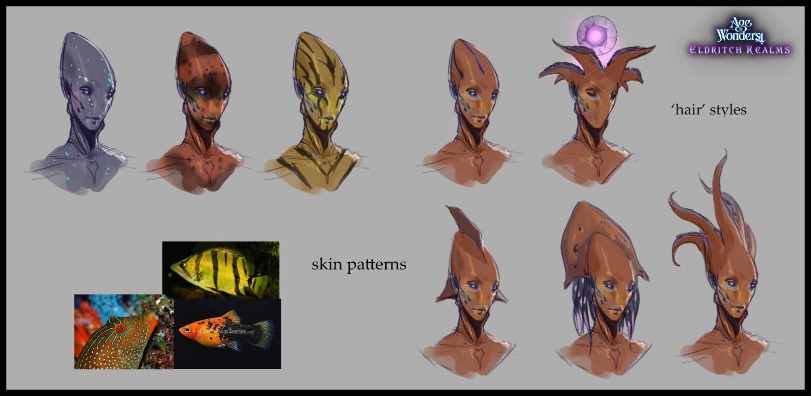
The forehead is the first thing to notice. It rises into a long wedge, leaving the eyes and mouth low on the face. Across the sheet, that same shape wears stripes, spots, fins and hanging tendrils. These unused Syron concepts already had a recognisable centre. For Age of Wonders 4, the interesting development was finding another place for it.
Triumph’s October 22 art diary traces the Aqualon back to those Eldritch Realms explorations. Game director Tom Bird explained at The Silver Seas launch on November 3 that the community’s response helped bring the idea back. It returned as a playable form, with more development between the old sheet and the final characters than the phrase “reused concept” might suggest.
Keep the strong idea and let the surface vary
The original sheet separates two sorts of decision unusually clearly. On the left, the tall head and slim neck stay almost fixed while skin patterns change. On the right, the head gains different fins and tentacles. You can compare colour without confusing it with a new silhouette, then compare silhouettes without inventing another face each time.
The fish references also have a specific job. Dark stripes travel over a yellow body; pale spots interrupt a blue-green field. The designs translate those relationships onto the forehead and cheek rather than simply attaching a fish’s head to a person. The anatomy supplies continuity while the markings offer variety.
The orange study darkens the area around the eyes, while the blue version scatters small luminous-looking marks across the upper head. Those treatments distribute attention differently on almost identical anatomy. Keeping the pose steady helps us see that difference. A presentation sheet can make a design decision clearer simply by controlling what changes between examples.
A model can drift away from the drawing
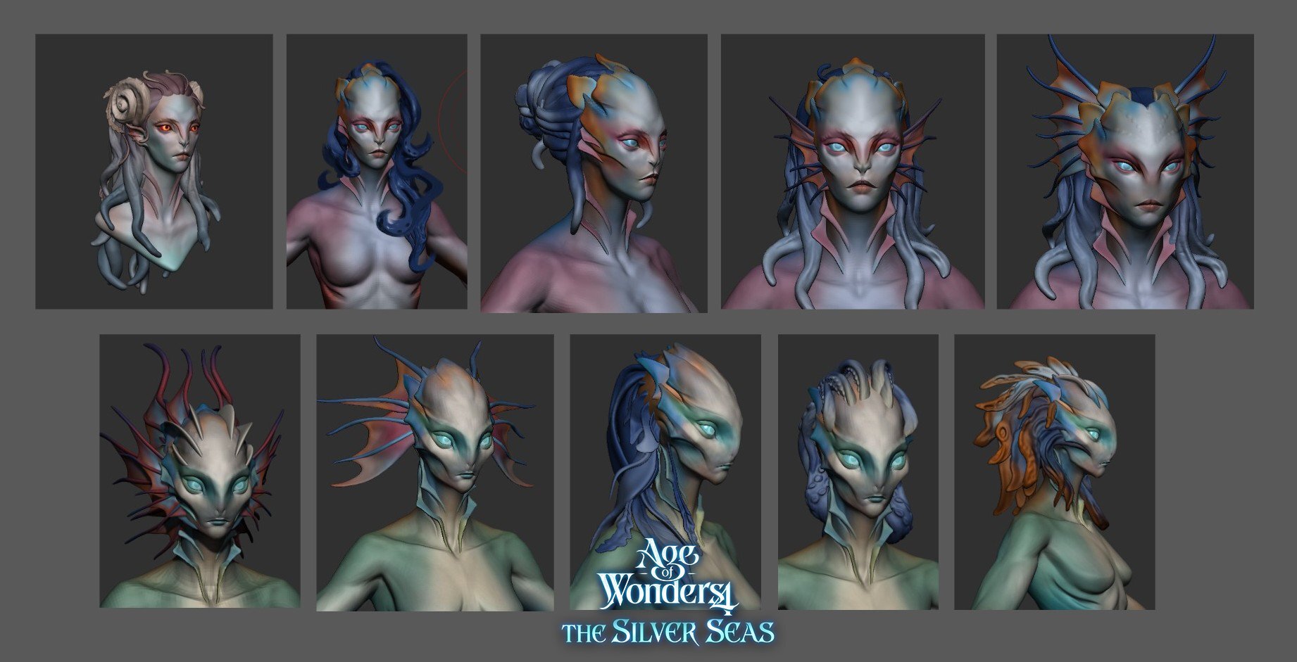
The sculpt sheet makes the next problem visible. Some upper-row faces have a prominent human nose, familiar lips and a head framed almost like hair. Other studies flatten the bridge, stretch the upper head and move the broadest shapes away from the cheeks. Those are large proportional changes, even where the surface finish remains similar.
Elle, the Triumph 2D artist who introduces the diary, describes returning from a more humanoid early sculpt toward the stranger proportions of the drawings: removing the nose and enlarging the forehead. The important comparison is therefore between stages of a design, rather than between a rough image and a supposedly inevitable polished result.
Look at the space around the eyes. With a smaller nose, the eye shapes and cheek planes become more exposed. The taper toward the chin feels sharper. Side fins can then expand outward without making the central face equally broad. The result keeps a readable face while allowing a distinctly unfamiliar head.
A name can leave room for more characters
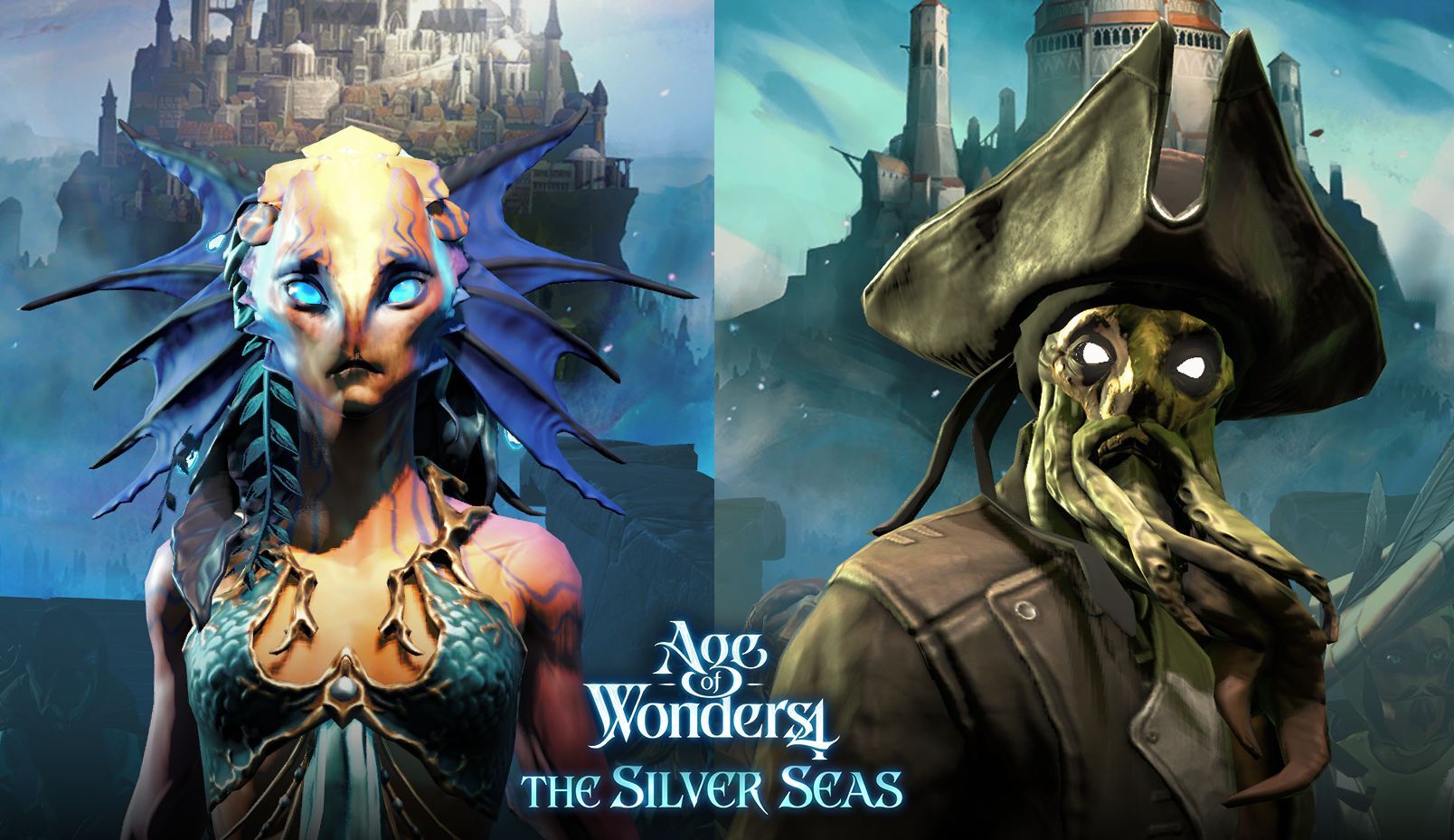
The diary also explains why the provisional name Squidkin became Aqualon: the wider name left room for options without tentacles. That choice is easy to understand beside the two finished rulers. One has a bright forehead and blue fins; the other wears a huge hat over a darker face and a hanging mass of tentacles.
Their equipment changes the outline considerably. On the left, the fins remain the widest part of the head. On the right, the hat takes that role and the tentacles extend the face downward. A flexible character family needs several recognisable landmarks, because clothing may cover whichever single feature looked most important in the original portrait.
Check the design beyond the portrait
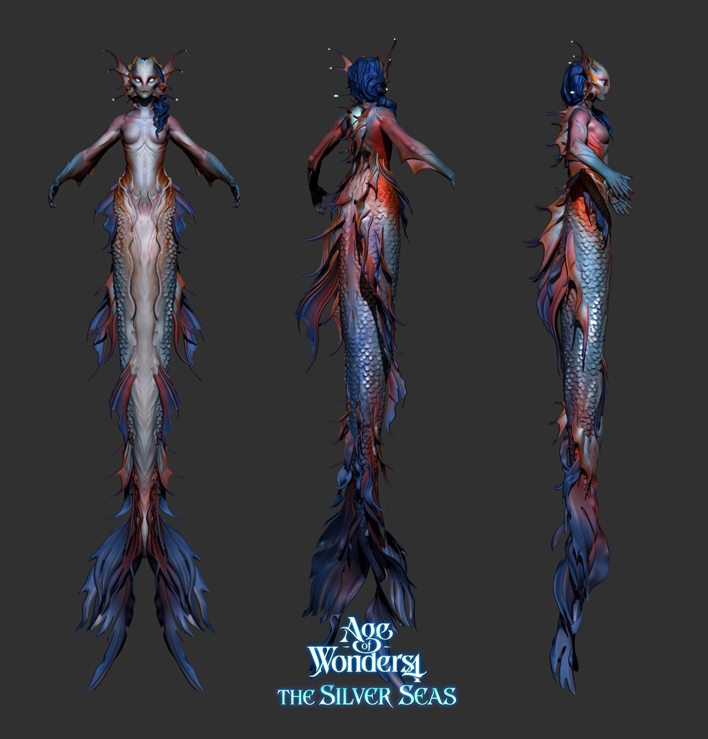
The long-tailed turnaround asks another useful question: how does that visual language continue below the shoulders? Blue and orange fins recur along the body, the scales change in size, and the side view reveals how far the thin edges project. Details that look like flat decoration from the front become actual interruptions in the profile.
This is an optional transformation associated with Children of the Waves, rather than a rule that every Aqualon has a tail. Keeping that distinction matters when reading game art. A body form, a cultural outfit and an additional transformation can overlap in one image without being the same design system.
The rear view matters, too. It gives the long body a stronger line of fins than the frontal view suggests. Seeing all three angles together prevents the attractive face from becoming our only measure of whether the design holds together.
Contrast makes the whole roster easier to read
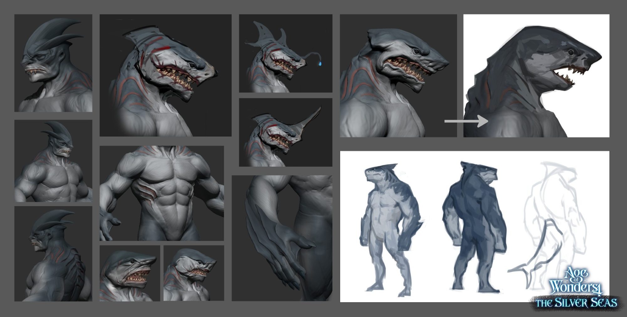
The Sharkkin studies offer a useful counterweight. Their broad upper bodies, projecting jaws and thick forearms occupy space very differently from the Aqualon’s narrow chins and fin-framed heads. Even on a grey sheet, the two groups suggest different weight and posture. An ocean theme can accommodate both without making one a slightly recoloured version of the other.
That is the value of seeing the unused drawings alongside the later work. The first sheet preserves a promising direction; subsequent studies discover what it needs to become a usable character family. Keeping those branches gives a team something concrete to revisit when a new brief finally fits. Here, the old idea survived because its distinctive proportions were worth developing further.