Aang is a small figure in a very large room. His red cloth catches the light, a broken ring of stone hangs above him, and foliage crowds the edges of the painting. It is a familiar character placed inside an unfamiliar scale of space. That relationship is the most interesting part of the new Avatar art-book preview: identity survives while the world around it becomes more imposing.
Avatar Aang: The Last Airbender: The Art of the Movie, by Ramin Zahed, is listed by Abrams with a November 10, 2026 publication date and 256 pages. This is a close reading of its cover and two interior spreads released through IGN’s November 5 preview, not a review of the complete book. The second spread includes imagery from an action sequence.
Recognition starts before the details
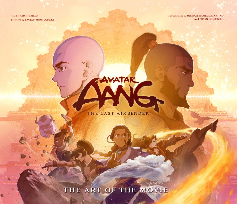
The cover gives Aang a strong profile: the arrow, shaved head, high collar and orange clothing work together as a compact identification system. The face is not asked to do all the work. At a smaller size, the outline of the head and the division between skin and clothing still establish a readable figure.
Below him, the group is organised through overlapping gestures rather than a straight lineup. A pale sweep of water cuts across the warmer colour field; an extended arm and a turned shoulder make different directions of movement visible. Even the crowded composition retains little pockets of separation around faces and hands.
For a character illustrator, that is a useful distinction between recognition and repetition. Keeping every familiar feature equally prominent can make a redesign feel like an inventory. Here, a few large signals carry the first reading, leaving smaller changes in costume and proportion to emerge afterwards. The cover alone cannot tell us how many alternatives were tried, but it shows which features survived into this published presentation.
A landscape that makes room for a person
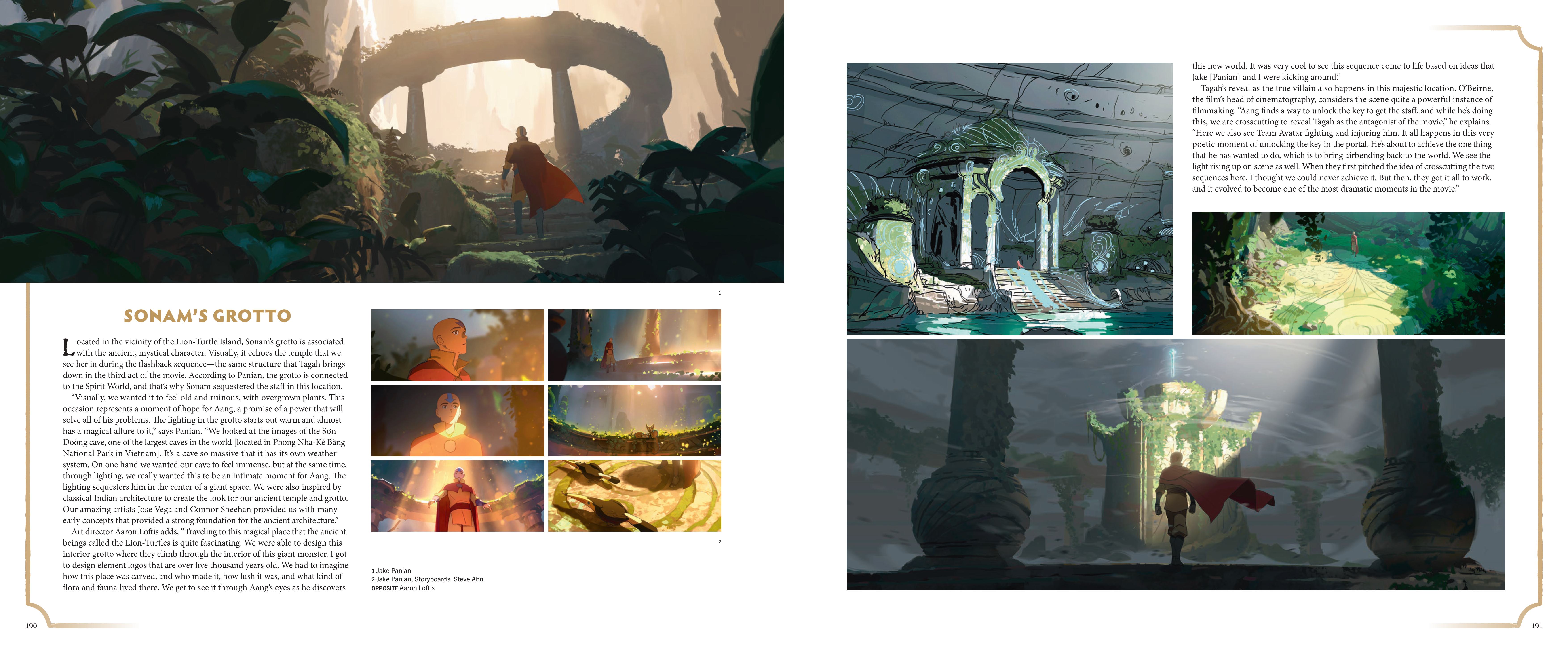
On pages 190–191, the main grotto painting gives the character an unusually generous amount of breathing room. Large dark leaves close in from the foreground, but the centre opens towards a pale, warm distance. The light area behind Aang separates his silhouette without requiring a bright outline around every edge.
The broken ring of architecture repeats the curve of the opening around him. Its pillars and missing sections suggest something built, damaged and then occupied by plants. The figure provides a measure of its size. Without him, the image could read as an attractive arrangement of ruins; with him, those ruins become a place someone has entered.
The accompanying text describes the balance between an immense cave and an intimate moment for Aang. That balance is visible in the paintings. The architecture supplies scale, while the lighting keeps directing attention back towards a person. The smaller architectural study is useful alongside the finished-looking colour image: steps, openings and carved surfaces remain legible before atmosphere softens their edges.
There is a practical lesson here for environment portfolios. A beauty shot can establish mood, while another view explains construction. They do not need to compete by being equally polished. A drawing that clarifies how someone reaches a doorway may answer a question that a more elaborate painting leaves unresolved.
Colour has to survive the cut
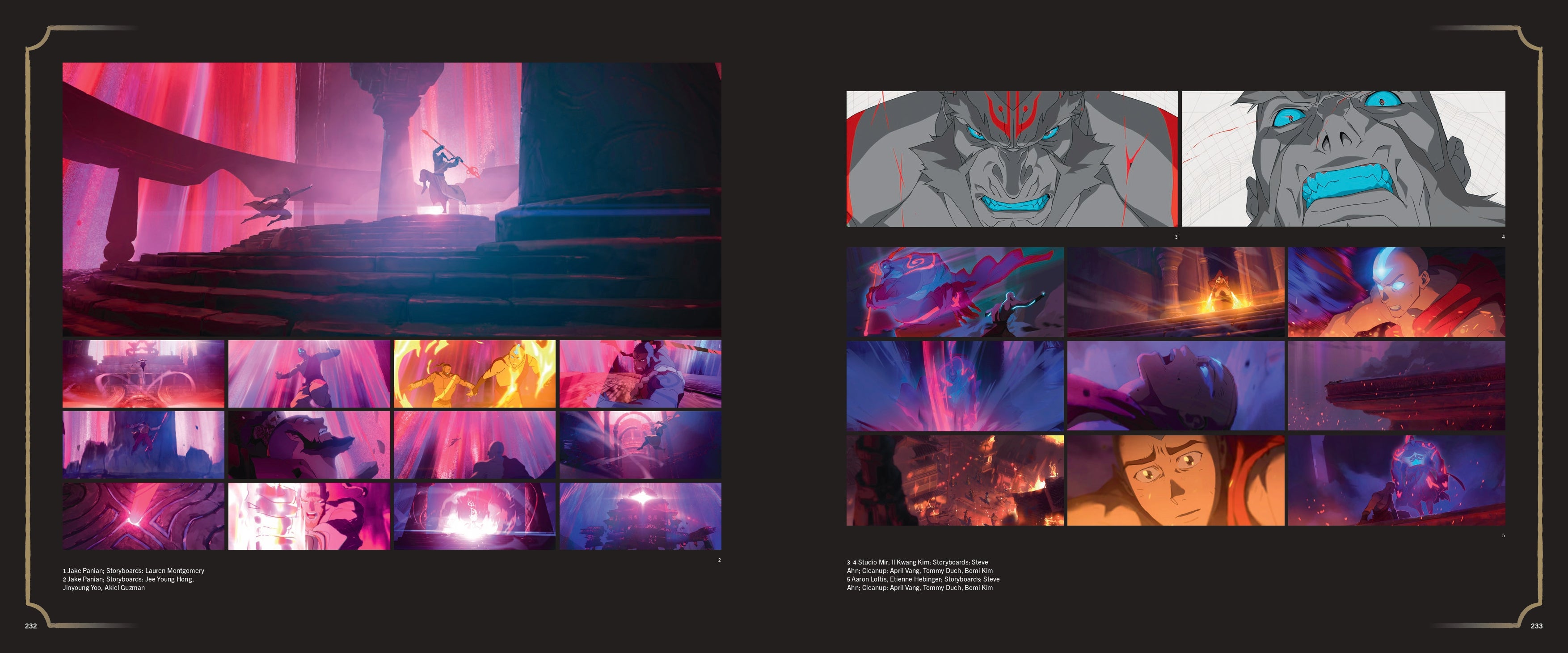
The later spread changes the temperature completely. Magenta light fills tall vertical spaces, blue shadows anchor the architecture, and orange accents interrupt the colder passages. Looking across the small images is more informative than studying only the largest one. The palette has to support wide views, faces, movement and moments of impact.
A wide staircase composition leaves the figures relatively dark against the bright interior. In the closer images, the face can take over as the focal point. The colour relationships remain connected, but the distribution of contrast changes with the framing. That is what makes a sequence feel designed rather than simply covered with one colour treatment.
The grey close-ups at the top of the right page make the distinction especially clear. Cyan mouths and eyes read immediately against the quieter faces. The large coloured sequence below distributes attention very differently. A single attractive palette would not solve both tasks; each image needs its own hierarchy.
Read the credits as part of the image
These spreads also resist the idea that a finished film image belongs to one pair of hands. Their credit blocks distinguish painted work, storyboards and cleanup. For a student, that is valuable information: the image on the page is also a record of different production responsibilities.
The strongest connection between these pages is that continuity does not require the lighting to stand still. Aang can remain recognisable beneath the warm opening of the grotto or inside a much harsher field of magenta and blue. The character carries certain signals; the scene changes their emphasis. Read beside the separate painting and storyboard credits, that becomes a concrete production problem rather than an abstract promise to honour a familiar style.