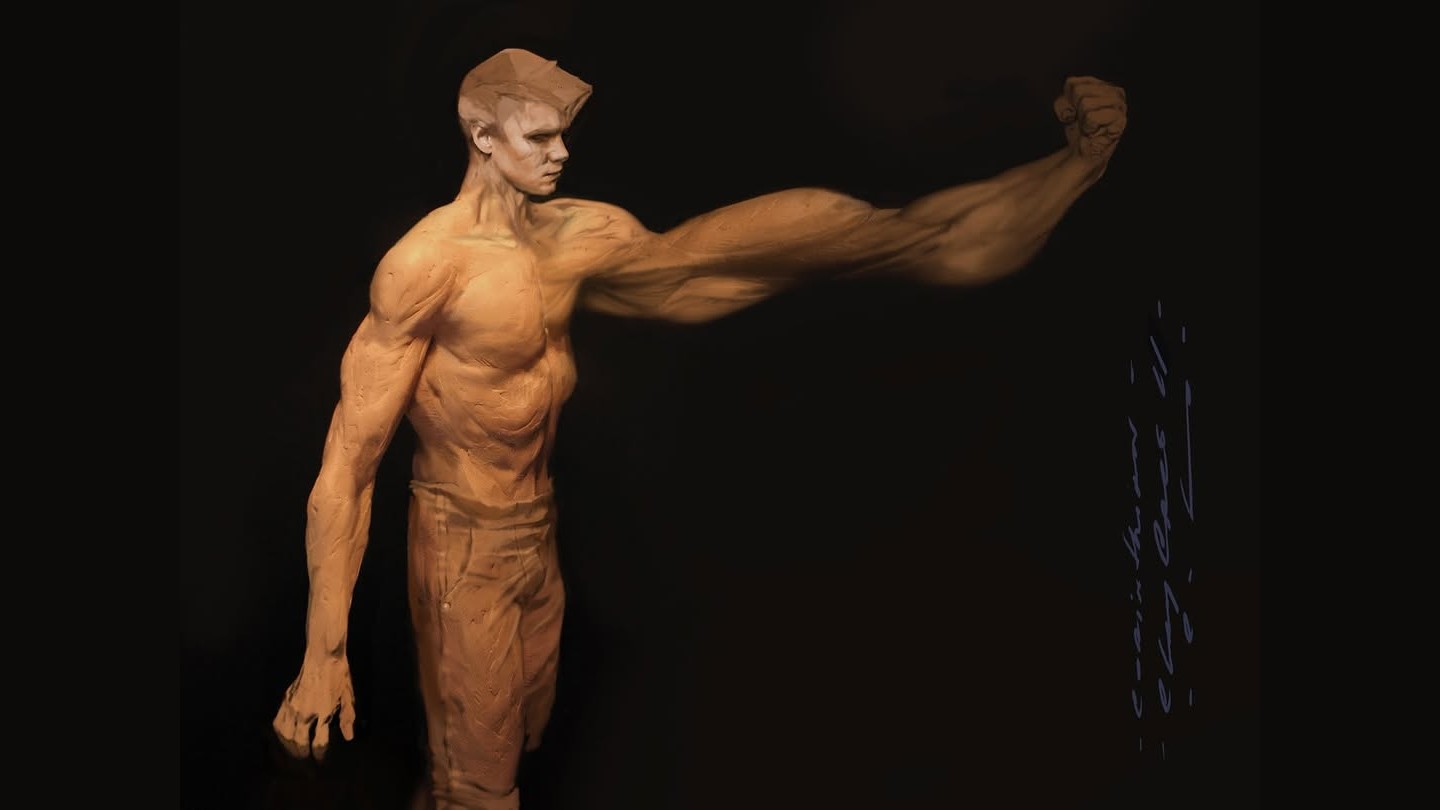
Carlos Huante’s early Clayface has a recognisable chest, head and stance, but one arm extends far beyond a human proportion. You can still read the body. That is precisely what makes its distortion uncomfortable.
These concepts belong to an early stage of development, before the film was greenlit. In comments accompanying his artwork, reproduced by Know-It-All Nation, Huante describes a brief, one-week engagement while the project’s direction was still taking shape. They should be read as possibilities he explored, rather than designs for the finished creature.
The character’s profession makes the loss of a stable face especially pointed. In DC’s official synopsis, Matt is an actor whose career collapses after he is disfigured. A treatment restores his appearance but has consequences he cannot control. That premise gives a creature designer two identities to keep in play: the face someone recognises and the unstable material threatening to erase it. A beautiful sculpt of an unfamiliar monster would answer only half of that problem.
Keep enough anatomy for the change to register

The long arm in the opening image creates a very specific tension. Its connection to the shoulder is understandable, so the extension feels like a change happening to a body rather than an unrelated shape attached to it. The quieter torso gives us something stable against which to judge the deformation.
That is a useful distinction for creature illustration. If every proportion changes at once, an image can become a new species rather than a person undergoing a transformation. Here, the remaining human structure is part of the horror.
Surface changes the kind of creature we see
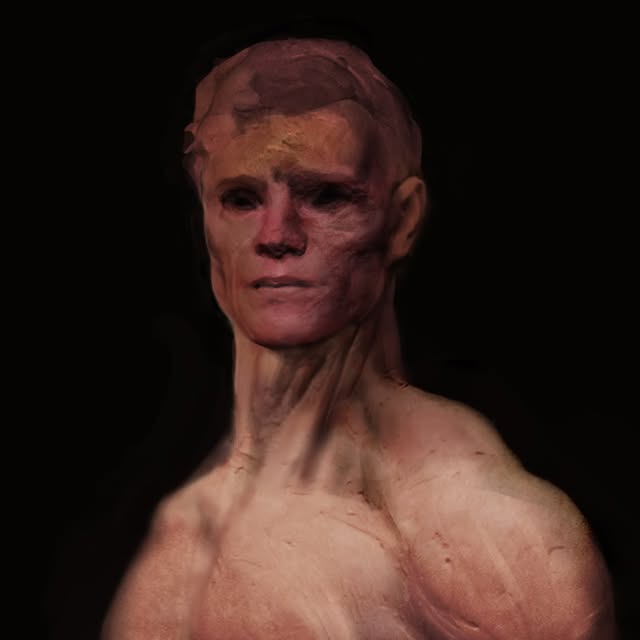
The grey study and the warmer clay figure produce different readings of the same broad problem. On the warmer figure, ridges and dragged-looking surfaces suggest a material that can be worked. In the grey treatment, light catching the irregular surface gives more emphasis to the mass and its texture. These are observations about Huante’s images, not evidence that either treatment was used in the final film.
The close reddish portrait is worth a slower look. Dark cavities gather around the eyes, while the nose and mouth remain distinct landmarks. The face is damaged and uneven, but it does not dissolve into a uniform crust. The paler neck provides a broader supporting shape, giving the head more visual emphasis. That hierarchy keeps the expression available even when the surface becomes difficult to parse.
The three pictures should not be arranged into an invented progression from sketch to approved design. They show different views and treatments, not a documented sequence of revisions. What we can compare is where Huante allows ambiguity: an edge may break up or a surface may seem to sag, while a few recognisable anatomical relationships hold the image together. Those stable points are doing an enormous amount of work.
Watkins wanted the person to remain visible
For the finished production, James Watkins described a related but separate problem to TechRadar’s Tom Power in an October 23 interview: the audience still needed to recognise Tom Rhys Harries’s Matt Hagen inside the monster. Watkins said the team made about seventeen versions, studying comics, Batman: The Animated Series and Creature Commandos, while adapting the design for live action.
He described the emotional target as “the man trapped inside the monster.” That puts the emphasis somewhere more specific than making a creature bigger or more grotesque. Eyes and recognisable features need to keep communicating distress while the body changes. The interview discusses the finale, so the original contains spoilers.
Gotham was designed to bear down on him
Watkins also explained the film’s environments in an interview with DC’s Jules Chin Greene. He and production designer James Price looked to German Expressionist cinema for Gotham’s looming architecture. Coast City received sunshine, greenery and pastel tones; Gotham was conceived as an oppressive contrast, with buildings dwarfing the people below.
Greene’s DC feature also describes a basketball game in the Narrows, a brief moment of daylight and ordinary social life. That detail complicates the easy version of Gotham as an uninterrupted collection of threatening alleys. A place can be harsh and still contain reasons for people to stay. For environment artists, giving the inhabitants somewhere to meet, rest or play can make the surrounding darkness more convincing.
It also gives a portfolio sequence a practical advantage over a single mood painting. Three locations can describe a range of experience: a public place that welcomes, a transitional space that unsettles, and a room that feels impossible to leave. The comparison with Clayface is about visual storytelling, not a claim that this was the production’s planning method. Contrast gives a threatening design somewhere to go.
For a concept artist, these accounts connect two scales of design: the face that must hold an emotion and the city that can intensify it. Huante’s early studies and Watkins’s production comments come from different stages, but both make more interesting reading when the question is what the image makes us feel about a person.