A collection can share a palette and still feel like nine unrelated pictures. David Oku’s Adobe anniversary pins are more interesting than that: the numbers become little constructions, and the same colours keep finding different jobs. A red face becomes a blue edge; a curve becomes a letterform; a software symbol becomes part of an object you could hold.
Adobe presented the nine-piece collection on October 28, 2026. In its interview, Oku connects the project to Bauhaus teaching and the progression from learning basic forms to combining skills. He describes beginning with sketchbook exploration before developing the artwork in Illustrator. The pins mark different lengths of time using Adobe tools, from two to forty years. That is the reported background; the reading below concerns what the published photographs and drawings actually show.
The number has to survive the picture
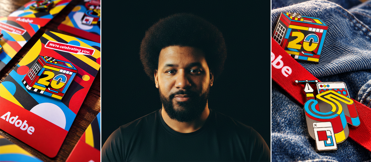
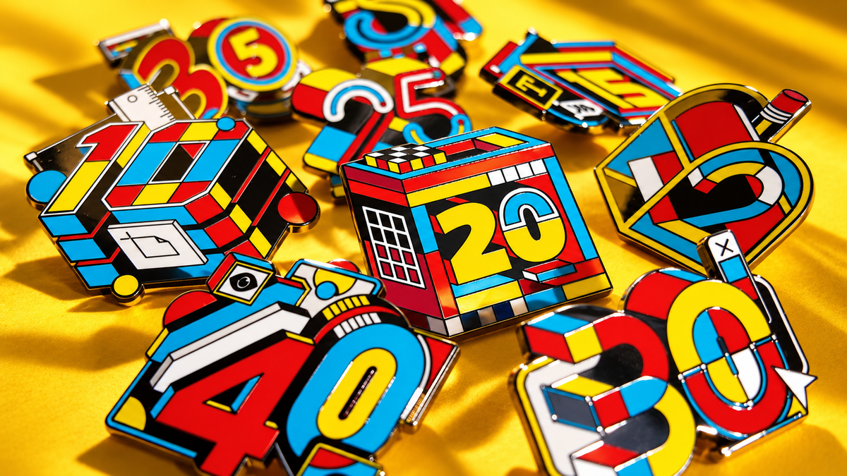
Look at the twenty-year pin in the collection photograph. A red rectangular frame encloses the numerals, while small white compartments line its top and a white grid occupies the left side. The yellow two remains a broad, readable shape. The zero is interrupted by blue and white, but its opening still distinguishes it from the surrounding blocks. Decoration approaches the number without completely swallowing it.
That is a useful tension for an illustrator. There is an immediate message, the anniversary, and a slower layer of discovery. If every tiny component had the same contrast and importance, those readings would compete. Here, large areas establish the number before the eye starts counting divisions. The white grid is intricate, yet it stays inside a smaller, clearly bounded region.
Colour provides continuity; edges provide variety
The ten-year design has an almost architectural arrangement of blocks. Beside it, the thirty-year design leans on rounded numerals and a pointed cursor shape. The forty-year piece adds a more irregular outline, with small protruding rectangles and circles above its large digits. Their outer shapes are different enough to identify separately, even though their colour vocabulary stays close.
Black does much of the organising. It separates bright areas, produces dark recesses and gives the saturated colours somewhere to stop. White is used more sparingly as a line, a face or a miniature panel. The result does not depend on giving every pin an identical balance of red, blue and yellow. The repeated relationships are enough to establish kinship.
There is also a distinction between depth drawn into the design and depth created by the physical pin. Flat colour faces suggest extruded numbers, while the photographed metal edges catch real highlights. Those two systems reinforce each other. This is worth noticing when illustration moves onto a product: the object contributes its own light, thickness and shadow, whether the drawing anticipates them or not.
The sketchbook shows a vocabulary being tested
The published sketchbook spread is dense with outlined objects, letters, numbers and tiny interface-like marks. Some forms are heavy and filled; others are open frameworks. What is useful here is the comparison within the page. A rounded shape sits near a hard-edged one; a simple sign competes with a more elaborate construction. These are visible differences, not proof of which sketch came first or how many revisions the client requested.
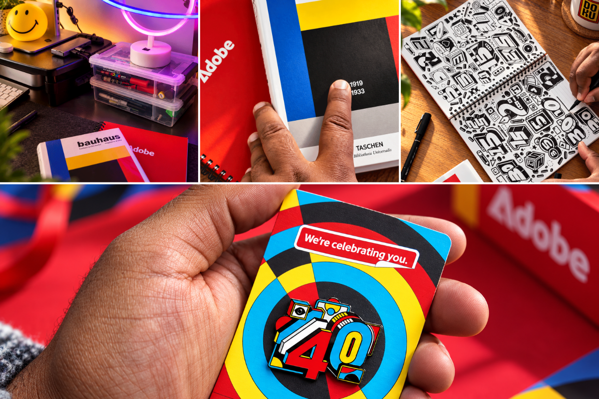
Seeing the black-and-white sketches beside the finished pin makes the colour choice easier to appreciate. The drawings already have substantial visual activity. Colour does not need to invent all the interest; it can group and distinguish what is there. On a crowded sheet, that difference matters. A pleasing palette can disguise weak structure, while a strong drawing gives colour something specific to organise.
The photographs also make a limitation visible: a pin is not a poster. There is little room for a delicate mark to remain separate from its neighbours. The strongest components here have generous interiors and firm boundaries. That observation transfers well to painted game icons. A small inventory image needs a recognisable mass before it can carry scratches, highlights or fine ornament. The appropriate level of detail depends on the viewing size, not simply on how much a large working canvas allows.
The card belongs to the illustration too
Behind the forty-year pin, the backing card expands the circular motif into broad rings. Its yellow, blue, red and black areas repeat the pin’s ingredients at a larger scale. The smaller object is busy; the larger surface gives that busyness a simple setting. Even the gap between the pin and the short message above it helps establish an order of attention.
For a series of character badges, collectible cards or illustrated icons, this is the practical question the project leaves behind: which elements must stay consistent, and which can change? Repeating every decision produces copies. Changing every decision makes the collection fall apart. Oku’s pins offer a concrete middle ground: stable colours and graphic edges, with room for the number, silhouette and density to change. Study the whole family, then return to one piece. Each view reveals decisions the other can hide.