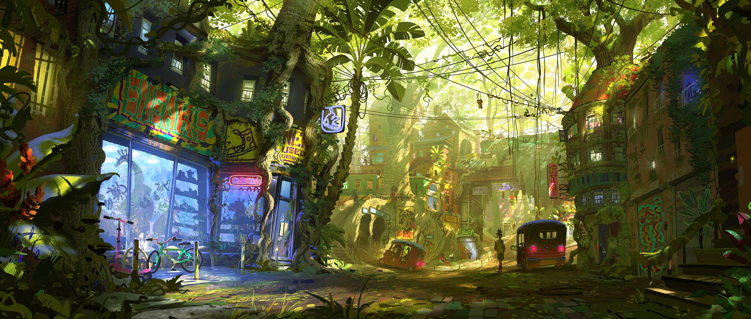
The blue light in the shoe-shop window is the first thing that catches me. Then there is the bicycle outside, the roots running through the buildings, and a pair of shoes hanging above the street. Gabriel Gomez’s Sneaker Shop makes a good case for letting an environment reveal itself in stages.
The painting won the Animated Feature Film — Environment category at the 2026 Concept Art Awards. The ceremony took place on October 24 at Pasadena Civic Auditorium during LightBox Expo. The official entry credits Gomez and Sony Pictures Animation. That is the verified award context; the observations below are a close reading of the artwork, rather than an account of his working process.
A shop window that can compete with a forest
This could easily have become a picture about giant trees. The trunks are enormous, the canopy occupies much of the upper frame, and the brightest daylight falls beyond the street. Yet the shop holds its own. Its cool window sits against surrounding yellow-green light, and the repeated rectangular panes give the eye a stable shape inside all that organic growth.
Notice how the display continues below the large sign. Shoes appear as silhouettes, while stickers and marks interrupt the glass. The information is varied without becoming equally loud. You understand the business before you read every sign; the open sign and parked bicycle suggest someone could walk in right now.
That distinction matters for environment painting. Adding more objects does not automatically make a location feel occupied. Objects need relationships: a bicycle beside a usable entrance, merchandise behind glass, cables connecting buildings. Here, the details describe activities and routes. They do more than cover a surface.
The magenta open sign is a small but effective accent. Against the blue shopfront, it separates the entrance from the adjacent display. The lettering remains subordinate to the window as a whole.
The street has somewhere to go
The road curves and drops away through the middle of the image. Buildings overlap into the light, while the dark foreground at either side keeps the view from spilling out of the frame. The overhead wires echo that movement across the street, but their uneven loops stop the composition from feeling mechanically tidy.
The vehicles provide another useful scale cue. They are small enough to sit under the tree canopy, but recognisable enough to measure the road. Their rear lights and silhouettes create intermediate stops between the near shop and distant buildings. The scene is busy; its sequence of distances is still easy to follow.
There is also a productive mismatch between the roots and the utilities. Thick organic forms push against the buildings, while thin straight wires cross the open space. Those two kinds of line help explain different systems occupying the same neighbourhood. Painting every cable with the weight of a branch would flatten that distinction. Here, their relative thickness gives the viewer information about both scale and material before any close inspection of texture.
One world, different ways of framing it
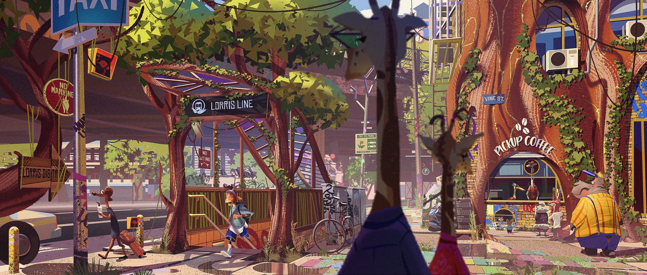
The awards gallery also includes Léa Pinto’s Subway Entrance. It shares the mix of urban infrastructure and living trees, but its composition operates at pavement level. A commuter emerges from the station while a coffee kiosk occupies a broad trunk. The large, soft foreground figure briefly interrupts our view, as another pedestrian would.
This is a particularly good comparison because it avoids treating a film’s visual identity as one repeated camera angle. Gomez uses depth and a luminous street opening. Pinto brings the activity closer and lets different-sized bodies pass through it. Both images make ordinary services feel adapted to their inhabitants.
Sony’s official synopsis describes an all-animal world and a small goat trying to enter professional roarball. You do not need to know the plot to enjoy these paintings, but that context makes their attention to scale especially relevant. Different bodies must share the same city.
Keep the light connected to daily life
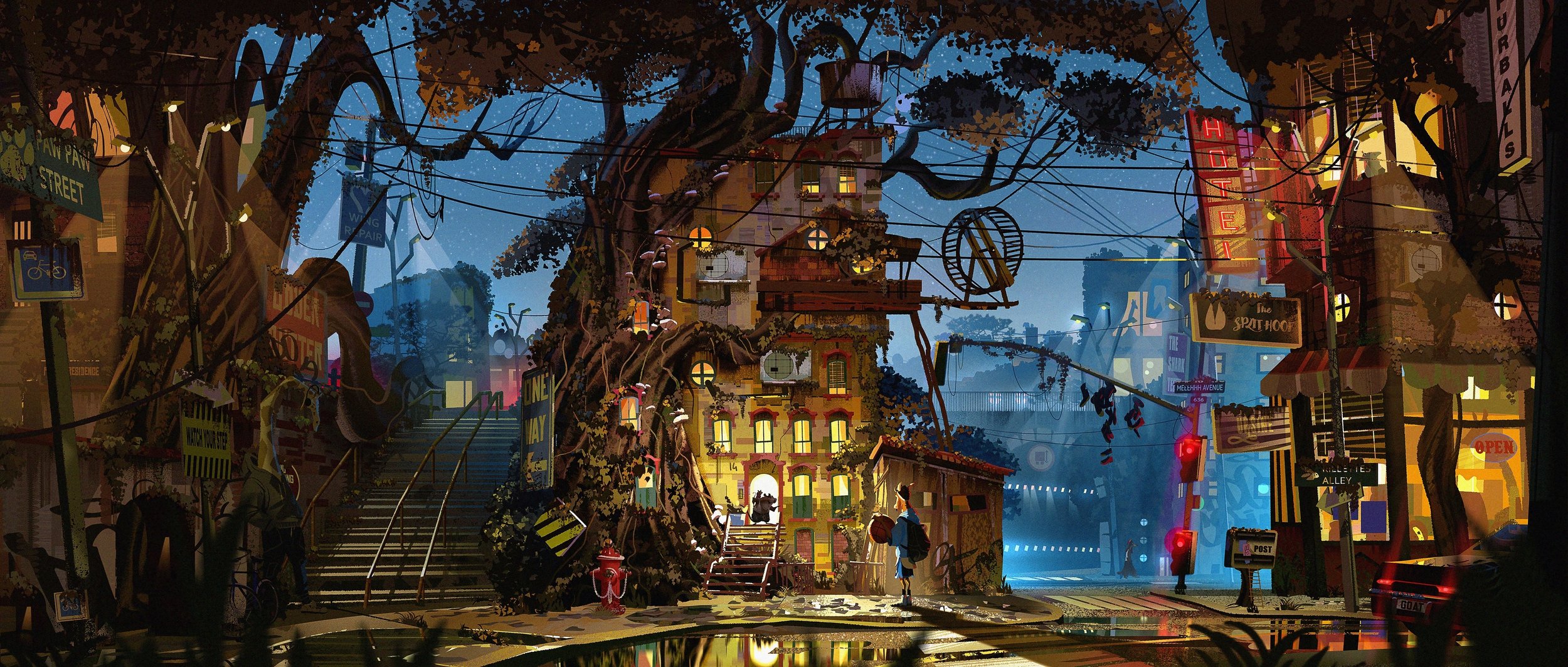
Pinto’s Franks’ Apartment changes the time of day. Warm windows and the illuminated entrance pick out occupied rooms against blue night. Steps, a fire hydrant, signs and a suspended wheel give the exterior its particular shape. The architecture remains eccentric, but the lighting tells a familiar story: people are home.
Returning to Sneaker Shop after those comparisons, its strongest quality is how little explaining it needs. The city is fantastic, yet the window display and street traffic are legible. For an illustrator, that is a more useful lesson than copying its foliage or brush texture. Give the viewer a recognisable activity, arrange the scene so they can find it, and let the strange parts grow around that anchor.
It is also worth looking at the paintings at two sizes. Reduced, the shop window and road remain distinct. Enlarged, the signs and small objects reward attention. A successful environment can satisfy both readings: a clear first impression and enough particular decisions to make a second visit worthwhile.