Castle Grayskull is easy to recognise as an image. Making it a place an actor can enter is a different assignment: its teeth need a scale, the mouth needs to work as an entrance, and the Jaw Bridge has to connect to something.
Production designer Guy Hendrix Dyas describes that assignment in Perspective’s September–October 2026 issue. His account of Masters of the Universe follows the work from an inherited fantasy world into character designs, a shared visual reference and physical sets. It is particularly useful for artists who want to understand what happens after a concept painting is approved.
Characters and environments developed together
Dyas says Travis Knight asked him to explore the characters alongside the world. The aim was to give costume and creature departments an initial visual direction while checking that people, vehicles and architecture belonged together. The character-development page credits Christopher Brändström’s He-Man study and Arthur Ripert’s Skeletor, Pig Boy and Goatman studies.
Those named contributions make the process easier to follow. A production designer establishes relationships across the film, while individual artists work out specific problems within that direction. The resulting collection should explain a world that other people can continue designing.
A shared visual direction becomes particularly important when the audience already knows the basic silhouettes. Grayskull cannot lose the skull, but recognition alone does not determine its thickness, its masonry or the space behind its face. Each new drawing has to answer something the familiar emblem leaves open. That is a more interesting assignment than simply increasing the detail on a remembered toy or cartoon image.
A compendium the whole production could use
The art department’s reference grew to more than 460 images, split between environments and transport, and characters, costumes, props and graphics. Dyas describes it as a resource used across departments. His account also notes that Goat Man’s imposing design helped the character acquire a larger role in the story.
That is a concrete example of design feeding back into storytelling. The artwork was doing more than recording decisions already made in a script. It helped the filmmakers see possibilities in a character.
A map before the individual locations
On the same page, Dyas explains that he began considering Eternia’s geography before concentrating on separate sets. His coloured-pencil map places story locations in relation to one another. The accompanying castle studies are also his: pencil drawings prepared for discussions with Knight. Beside Vyoukal’s atmospheric illustration, they show two different uses of drawing within the same project.
The map is especially revealing because it deals with connections. Roads, water and the relationship between a palace and a fortress influence how a world can be imagined as a continuous place. A portfolio full of impressive locations can leave those relationships unspecified. Here, the broader drawing gives individual environments a context without asking every concept image to explain the entire territory.
The pencil castle study makes another distinction visible. The approach is drawn close enough to inspect the teeth, entrance and supporting rock. The colour illustration pulls back into an encounter with the whole building. One invites questions about construction; the other establishes anticipation. Reading them together is more useful than ranking them by which looks more finished.
Where the physical castle stopped
For Grayskull, the practical exterior reached the skull’s cheekbones; the upper part was extended digitally. A constructed corridor connected the entrance towards a sword chamber on a soundstage. The construction page shows the chamber through Bart Tchorzewski’s illustration and a model credited to Jeanie King, Filipe Miranda and Francesca Tesei.
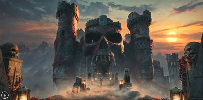
The illustration at the top of this article, by Jakub Vyoukal, gives us the experience of approaching the castle. The small figures and lights establish scale; the route leads towards the mouth. It has an atmospheric job, while the chamber model answers spatial and construction questions. Neither image needs to carry all of that information alone.
Look again at Vyoukal’s use of light. Warm accents mark the approach, while the towers and skull sit within a cooler mass. The distant sunset introduces a second scale: it belongs to the landscape beyond the building. The castle consequently feels both immense beside the figures and situated within a larger place. Those relationships remain clear even when individual stones become indistinct.
For a painter preparing a similar design, the question is which information belongs in which view. A low, dramatic camera can communicate awe but obscure the route through a doorway. A closer drawing can explain that route with little atmosphere. Giving each image a clear purpose makes a presentation more useful to the people who must interpret it.
This is why the original feature is worth reading beyond its most spectacular picture. A concept, a model and a set photograph are evidence of different decisions. Seeing them together makes the production’s ambition tangible: a memorable silhouette has to survive as a route, an entrance and a place where the action can happen.
Open the Perspective reader and archive or go directly to Dyas’s original feature for the full article, additional artwork and production credits.