The courtyard looks inviting before it looks technically complicated. Sunlight crosses the pale floor, cushions gather around low tables, and ivy interrupts the straight lines of the balcony. Myriad’s strongest lesson is in that order: first you understand the place, then you begin to notice what it is made from.
In a November 4 breakdown, New3dge’s student team describes a practical compromise: hand-painted props and plants alongside reusable, brushstroke-like materials made in Substance 3D Designer. Eight students made the demo over five months. The environment team was Alexia Etoubleau, Laura Foissac and Blandine Roy. Rather than retelling their entire production diary, let’s look at how those parts hold together on screen.
A busy courtyard needs quiet surfaces
Start with Etoubleau’s patio image above. There is plenty to look at, but the wall does not compete equally with every object in front of it. Large areas of warm plaster sit between the windows. The cracks and colour variation remain softer than the dark openings, leafy edges and furniture silhouettes.
That gives the courtyard a useful rhythm. Narrow windows repeat across the upper wall; below them, broader arches make heavier dark shapes. The eye can read the building as a few substantial masses before getting caught in the latticework. The architecture supplies an arrangement for detail instead of letting detail dictate the whole picture.
The greens also arrive in different sizes. The pool is a broad, relatively stable colour area. Ivy breaks into small fragments. The foreground leaves become large shapes that partly hide the view. Repeating a colour does not require repeating its visual weight, and those differences help the scene avoid becoming one uniform layer of decoration.
There is a practical painting lesson here. If every tile, cushion and vine gets the same contrast, the courtyard loses its depth. In this view, sunlight connects separate objects through a larger pattern of light and shadow. The illumination gives the assembled assets something in common that their textures alone could not provide.
Look at the furniture before the finished room
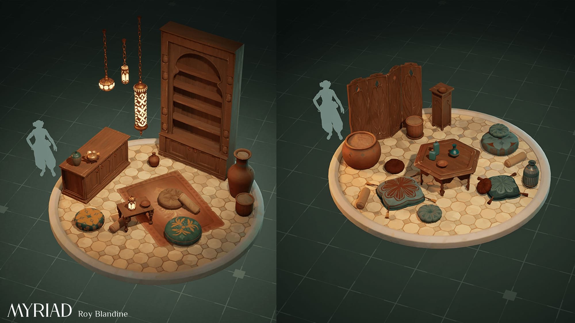
Roy’s own portfolio entry identifies her work on the opening parlor, furniture, small assets and the relic carried by the protagonist. Her props sheet is especially helpful because it removes the flattering context of a finished environment. We can compare the objects directly.
The wood stays within a fairly restrained brown family. Taller pieces have arched or pointed profiles, while low tables spread outward with clipped corners. Cushions introduce softer outlines and teal accents. Even the vessels vary by height and neck width, so a collection of small objects can produce a silhouette more interesting than a row of equal-sized pots.
Notice the scale figures beside the displays. A cupboard and a cushion cannot be judged only by their attractive surface treatment; they must also belong to the same person-sized world. The sheet makes their relationship legible. It is a useful reminder for an illustrator preparing an environment handoff: the recipient needs dimensions and comparison, not just atmosphere.
The two arrangements suggest different uses without requiring a completely new visual vocabulary. One places storage and a tall cabinet beside a small table. The other is organised around a larger low table and floor seating. The objects tell us where someone might sit, put a cup down or store possessions. Decoration becomes more convincing when it has something to decorate.
The kit is part of the art direction
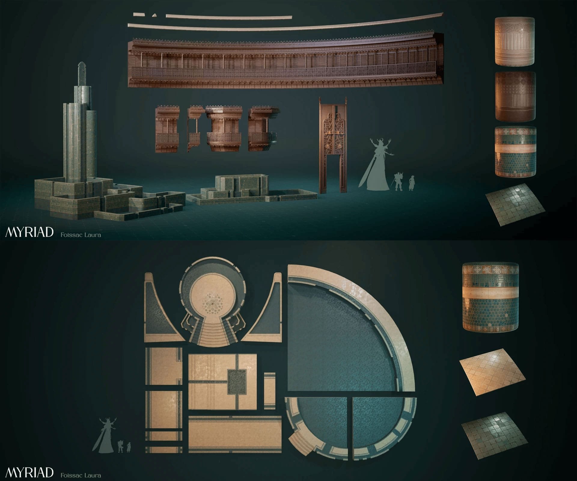
Foissac’s module sheets reveal a different kind of drawing problem. A continuous balcony is presented alongside shorter pieces; the circular floor separates into arcs and straight connecting sections. These are not simply isolated beautiful objects. Their edges have to meet, and their patterns have to survive being assembled into something larger.
The material samples at the right are worth a close look. Horizontal bands organise the cylinders, while the floor samples alternate between stronger borders and quieter fields. Pattern has a location and a job. It marks a transition, finishes an edge or reinforces a surface, rather than covering everything with the same level of ornament.
For concept artists, this is where a finished painting can leave important questions unanswered. Where does a decorative strip stop? What happens when a wall turns a corner? How much variation can one module tolerate before it no longer joins its neighbour? A convincing keyframe starts the conversation; a useful design sheet makes those relationships clear enough for somebody else to build.
The appeal of Myriad is not evidence that every surface needed an individual painting. It is evidence that the surfaces needed to agree. Light, scale, colour and the placement of ornament keep the courtyard coherent. Those are decisions a small team can discuss and test long before it has produced hundreds of finished assets.