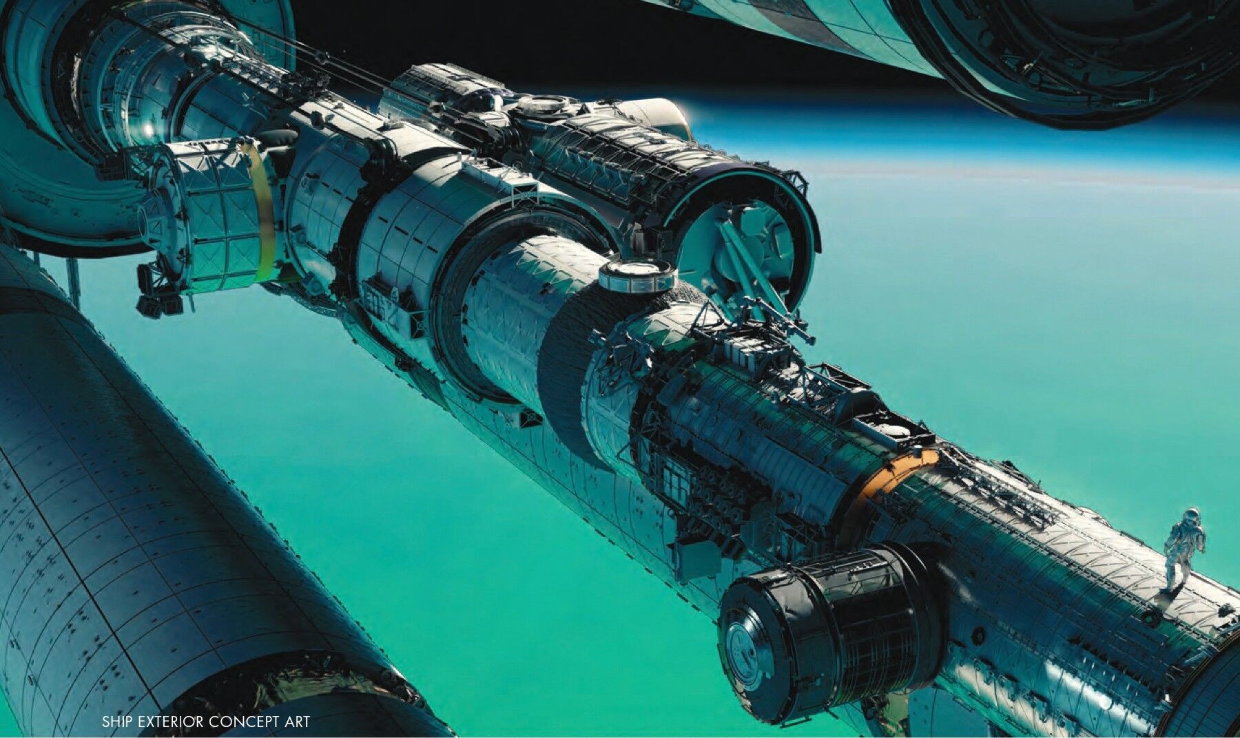
Find the astronaut on the right of the exterior painting. The figure is tiny, almost easy to overlook, but it makes the spacecraft understandable. Those cylinders are suddenly rooms someone could enter; the dark strips become routes someone might have to cross. Before we get to the machinery, the painting has established a person’s relationship to it.
Charles Wood’s A Unique and Wondrous Journey, in Perspective’s May–June 2026 issue, follows Project Hail Mary from design work to constructed spaces. The selected concepts here are worth looking at together: they give the ship a consistent physical vocabulary while making its rooms feel surprisingly different.
A complicated machine needs a clear first reading
The exterior is busy with braces, panels and insulation. Its larger arrangement is much simpler: a long central body, projecting cylinders and repeating circular openings. The diagonal carries us across the painting. Detail explains the construction without breaking that main direction.
There is also a useful difference between the ship and its surroundings. Pale, broken metal catches the light against a broad turquoise field. The planet supplies colour and scale without competing panel by panel. Squint at the image and the vessel still holds together.
Wood describes reference visits and consultation during preproduction, including access to NASA. That research matters, but this painting shows another task: organising the information so an audience can grasp a machine it has never seen before.
Let the room show what a person does there
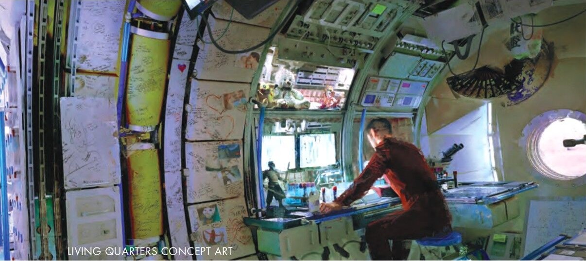
The living-quarters concept brings the scale down to a workbench. A leaning figure, containers, equipment and notes make the space feel occupied. Instead of treating the wall as an empty surface waiting for futuristic decoration, the image gives it the accumulated marks of use.
Look at the circular window beside the figure. It is a clear, bright shape in a fairly crowded room. The surrounding papers and fittings can remain irregular because that larger opening steadies the composition. The furniture also gives the body something convincing to lean against.
For an environment painter, that relationship is more revealing than any single gadget. A room starts to feel habitable when its objects support an activity: reaching, sitting, repairing, looking outside. Here, the figure’s posture makes the work surface part of the story.
Change the light before changing the whole design
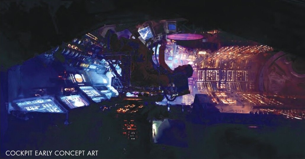
The early cockpit concept has a different temperature. Blue and violet instruments face a warmer bank of orange light. A dark chair interrupts their glow. Rather than showing every control equally, the painting groups the illumination into a few larger patches.
The chair is important precisely because it contains less information. It gives the surrounding instruments something to wrap around. The cockpit reads as a place with a central occupant, rather than a flat collection of attractive screens.
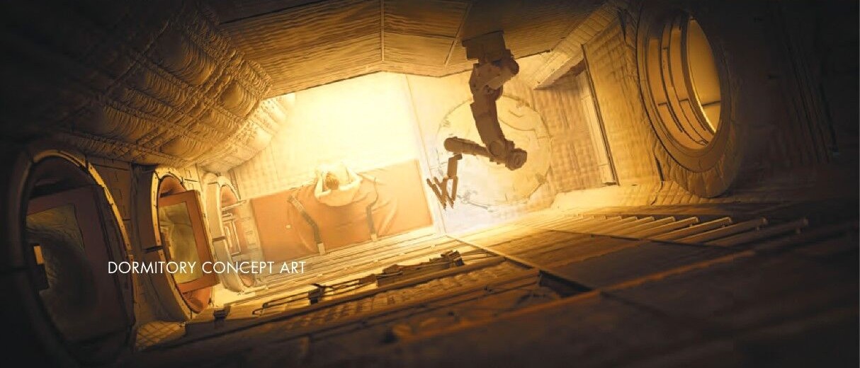
Compare that with the dormitory painting. Warm light spreads over padded surfaces, and the figure hangs beside the bright opening. There are fewer sharp interruptions. The large soft shapes make the room feel closer to the body than the cockpit’s dense banks of equipment.
Both images still belong to a cylindrical ship. Their contrast comes through material, density and light, not a completely unrelated architecture. That is a practical way to develop several locations within one world without giving every room the same mood.
Gravity turns a drawing into a production problem
Wood identifies four gravity conditions the design had to accommodate: acceleration, weightlessness, centrifugal gravity and perpendicular gravity. A passage could change orientation; a ladder could become a floor. He also describes close collaboration with cinematographer Greig Fraser and VFX supervisor Paul Lambert.
That changes how we look at these concepts. A convincing surface is only part of the assignment. The space also needs a usable relationship between openings, handholds and equipment when the body is no longer standing where we expect.
Give the unfamiliar world a different visual rhythm
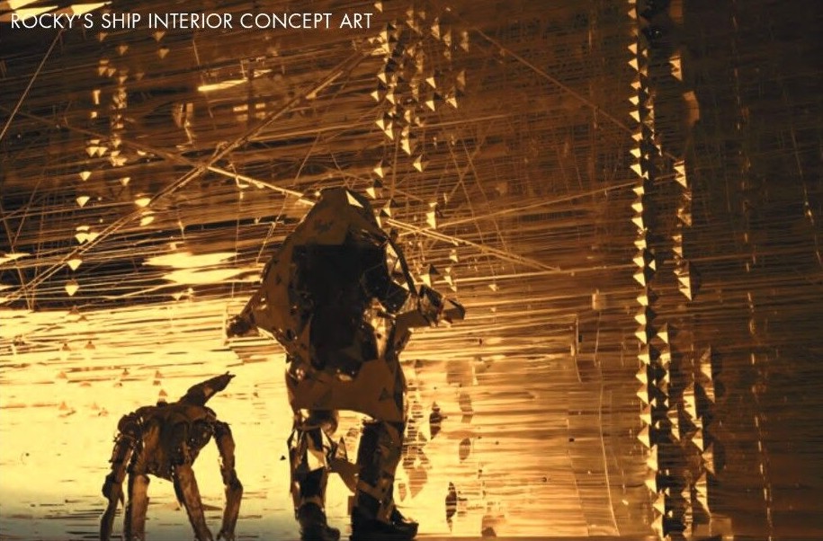
Rocky’s interior replaces the human ship’s broad panels with fine golden strands and suspended angular forms. Two dark figures keep the scale legible. The space can become extraordinarily intricate because those simple silhouettes give the eye a place to settle.
Compare the edges, rather than just the colours. The Hail Mary is built from masses we can separate; this room seems threaded together. That contrast makes the encounter visually interesting before any explanation of its technology. Two worlds can share a scene and still look as though they were imagined differently.
One detail worth keeping is the change in spacing. Near the figures, larger angular forms give us something to recognise; farther away, the fine lines gather into a luminous field. The image does not ask us to count every strand. It lets density describe the room, while the dark bodies stop that density from swallowing the point of the scene.
Source note: these are selected concept-art details, not photographs of finished sets. Perspective credits the wider art department but does not assign an individual artist in these image captions. The visual readings above are our analysis; Wood’s production account and the complete team credits remain available in the original issue.