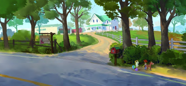
The farmhouse is easy to find. A pale road bends between dark trees, the white fence catches the sun, and the house waits at the top of the rise. Then you notice the toys beside the mailbox. Suddenly, a pleasant country entrance becomes a considerable journey. Kristian Norelius’s painting gives us the human scale and the toy scale in the same glance.
It is one of the concepts in production designer Bob Pauley’s Tech vs. Playtime, published in Perspective’s September–October 2026 issue. These five selections follow a useful chain: a character’s shape, the layout of a place, the objects left inside it, and the different visual rules of a child’s imagination.
A device needs a body before it needs a face
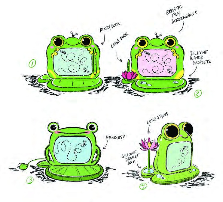
Deanna Marsigliese’s early Lilypad sheet is wonderfully specific about what kind of object this character might be. The screen sits inside a green frog-shaped casing. Round eyes rise above it, while the base spreads outward like a leaf. Even without an animated expression, that outline suggests a toy someone could pick up and leave on a desk.
The alternatives test how the object works. A side view shows the thickness behind the screen; another sketch folds the body over a circular base. Handwritten notes consider handles, a lotus stylus and silicone droplets. Those small questions keep the design attached to use. Where would a child hold it? What rests on the table when it opens?
Watch the relationship between the eye circles and the rectangular display. The eyes pull the shape upward, while the base gives it a broad, stable footprint. Changing those proportions would change its apparent age and temperament before any dialogue arrived. The exploratory drawing earns its place by making several possibilities easy to compare.
The landscape and the plan answer different questions
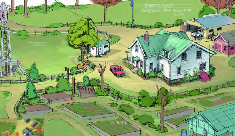
Return to Norelius’s farmhouse painting, then compare it with the elevated layout. The first image lets us arrive. The second lets us understand where things stand: house, outbuildings, fenced ground, trees and the route looping through them. It trades the roadside painting’s deep shadows for a clearer inventory of relationships.
The drive is especially useful to follow. It connects areas that could otherwise feel like separate illustrations. Fences divide the ground without making every patch equally important; the roof shapes remain recognisable from above. There is enough information to imagine moving through the place, while room remains for a scene to choose its own angle.
This pairing is worth keeping in mind when presenting an environment. A seductive view can establish mood while leaving a practical question unanswered. A second drawing can clarify access, distance or overlap. Giving each image a distinct task makes the collection more useful than a row of nearly identical beauty shots.
The roadside painting also leaves a surprisingly generous patch of road in front of us. That quiet blue-grey area makes the bright entrance feel farther away. The little figures stand near its edge, where warm light crosses the pavement. Their small colour accents register without demanding the same painted detail as the farmhouse. Distance comes from the distribution of information as much as perspective.
Let the room belong to someone
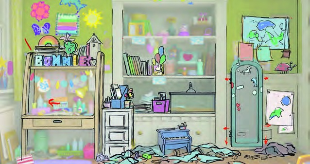
Nathaniel McLaughlin’s bedroom drawing feels occupied before Bonnie enters it. Pictures gather around the low mirror, materials crowd the desk, and the decorated easel sits beside storage. The marks have different sizes and rhythms. They read as a growing collection rather than one tidy decorative pattern repeated across a wall.
The larger furniture shapes still organise the image. The shelf and desk give us horizontal bands; the mirror supplies a tall, narrow interruption. Loose objects break those bands near the floor. If every scrap had the same contrast as the mirror frame, the room would be much harder to read. The clutter works because the structure underneath remains simple.
Pauley discussed the importance of physical details in an earlier UNIQLO interview: children know toys through touch, mechanisms and their limitations. That is a useful connection here. A familiar room needs objects that seem handled, reachable and accumulated over time.
Imagination changes the painting’s rules
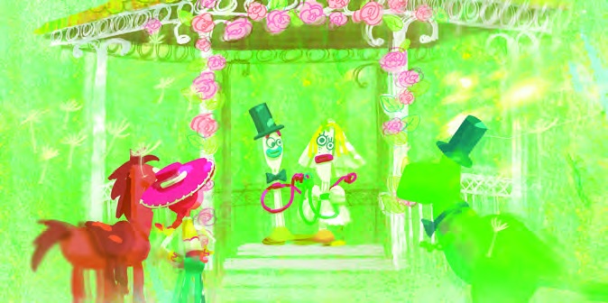
Carlos Felipe León’s wedding concept makes the strongest change of language. Bright green runs through the ground, figures and surrounding marks. Pink flowers circle the opening above the couple. The edges are uneven and the colour often spills across forms, giving the scene the energy of a picture made with crayons.
There is still a composition holding it together. The arch encloses the central pair, the taller green figure stands to the right, and Jessie and Bullseye gather at the left. We can understand the ceremony without asking every shape to behave like a realistically lit object. Pink against green does much of the organising.
Placed beside the farmhouse, it shows how far a film’s artwork can travel while remaining concerned with the same characters. One image draws us along a believable road; another gathers us around an exuberant handmade celebration. The interesting lesson is in that change of purpose. Each painting chooses the detail, space and colour its particular moment needs.