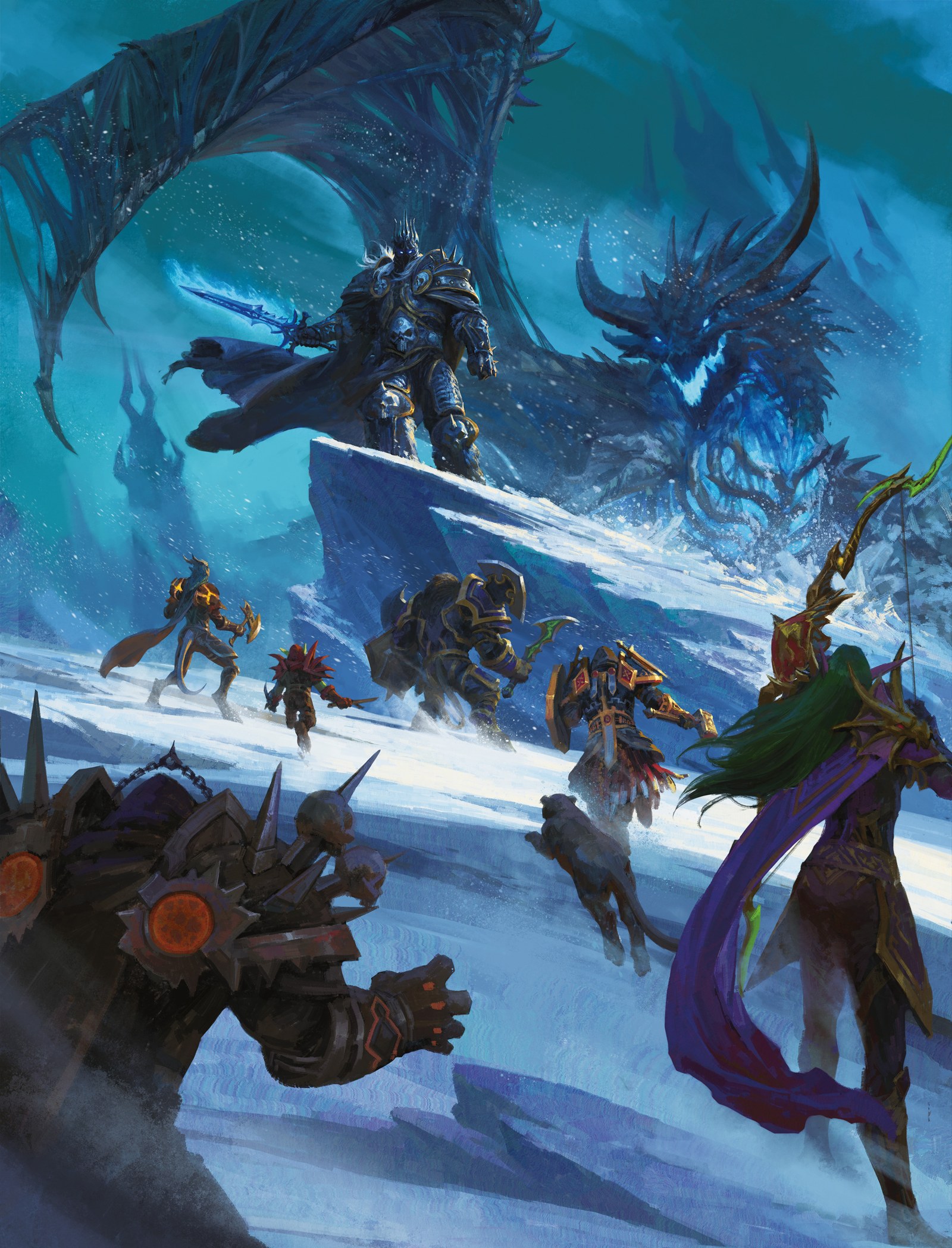
The people at the bottom of Wu Dejian’s cover are already small. Above them, an icy ledge leads toward an armoured figure and a dragon whose head nearly fills the opening behind him. The picture establishes the scale of the encounter before we identify every weapon. For a book inviting players into Azeroth, that is an effective place to begin.
Dungeons & Dragons: World of Warcraft released on November 17. Its official previews offer more than a new set of rules to examine: they put familiar characters and places into the same illustrated collection. Looking at the covers beside the environment paintings reveals several ways of keeping a world recognisable across very different images.
Let the cast lead us toward the threat
The book’s credits identify Wu Dejian as the standard-cover illustrator and describe Alliance and Horde adventurers confronting the Lich King and Sindragosa. That description matters: this is an encounter bringing adventurers together, rather than a simple picture of one faction opposing the other.
The composition gives the smaller figures several jobs. Foreground shoulders and weapons establish our position near the group. Figures farther up the ledge make its distance measurable. Their overlapping silhouettes also lead inward, so the eye reaches the main threat through the party rather than jumping past them to the largest head.
Cold blues unite the stone, snow and enormous forms above. Small warmer accents keep the adventurers from becoming one uninterrupted dark strip. The contrast is uneven in a useful way: some details can disappear while a head, blade or bright patch remains readable. Scale depends on those few surviving signs of a person.
Another cover can make another promise
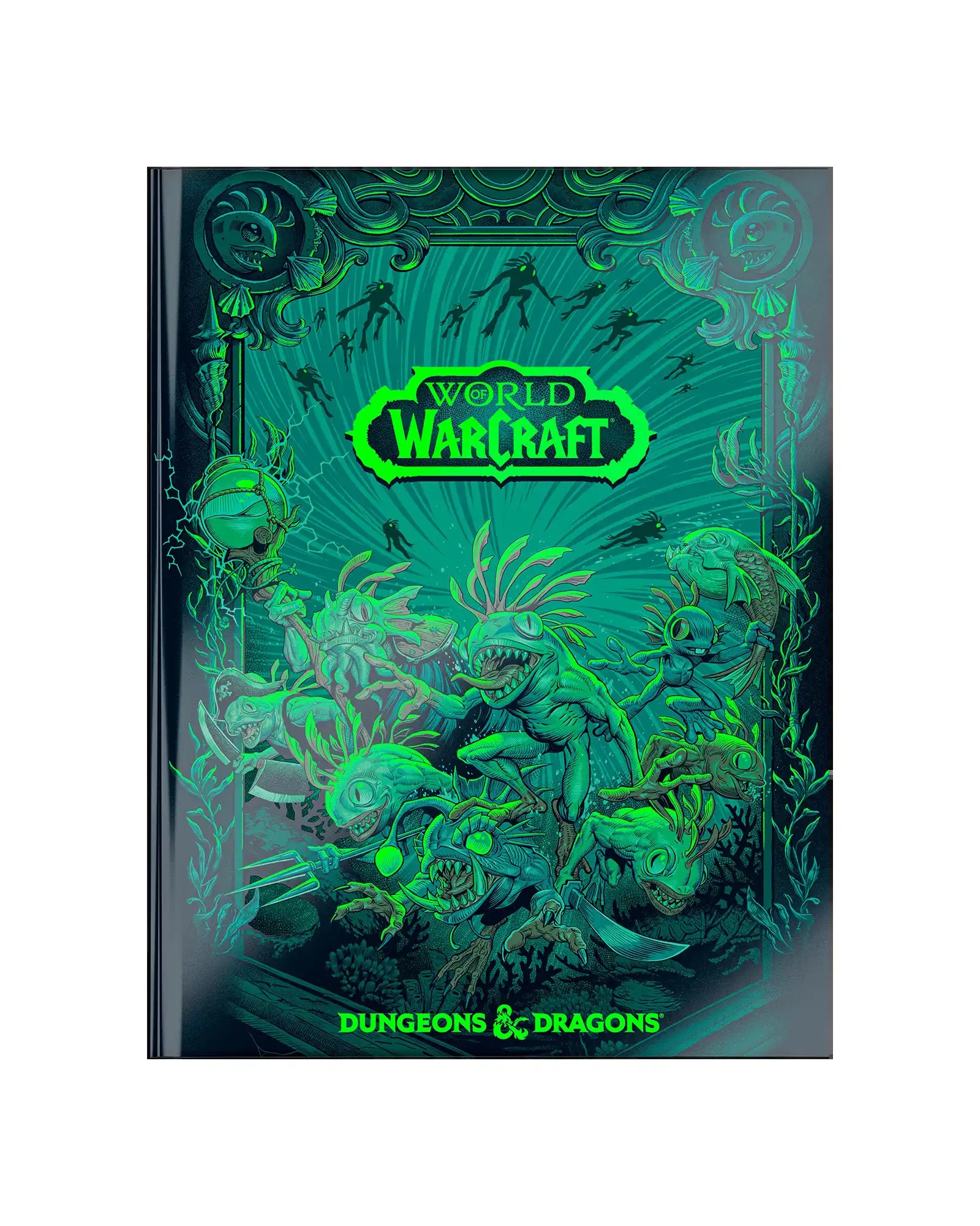
The official alternate cover changes the invitation. Its green Murlocs, curved fins and tightly packed decorative shapes ask us to explore a surface instead of following a party into deep space. The book image shown here is a product preview; it does not tell us how the physical finish behaves under different lighting.
Wizards calls this the Neon Ink alternate cover. Visually, the repeated creatures and enclosing shapes produce a much denser rhythm than the standard cover’s large icy opening. It still belongs to the same world, but it draws on the appeal of its smaller, stranger inhabitants. A recognisable setting can support more than one kind of spectacle.
A city announces itself through large shapes
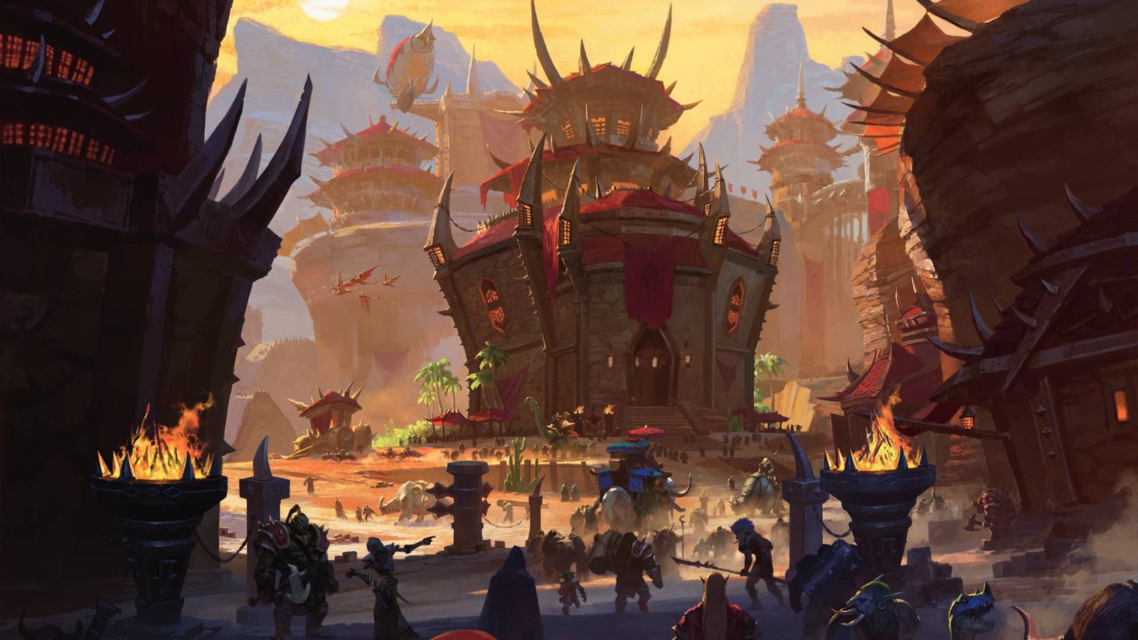
Bayard Wu’s Orgrimmar illustration offers another route into Warcraft’s identity. The central tower gathers broad red surfaces, dark framing and outward-pointing forms into one heavy mass. Smaller buildings cluster behind it. In front, people and shadows provide a scale we can understand without measuring a doorway.
The street is an important part of the painting. It leaves room for the eye to travel toward the architecture, while foreground edges frame the approach. Most of the small activity stays low in the composition. The tower can remain busy with spikes and beams because the ground gives that complexity somewhere relatively quiet to stand.
Compare the structure, not just the palette
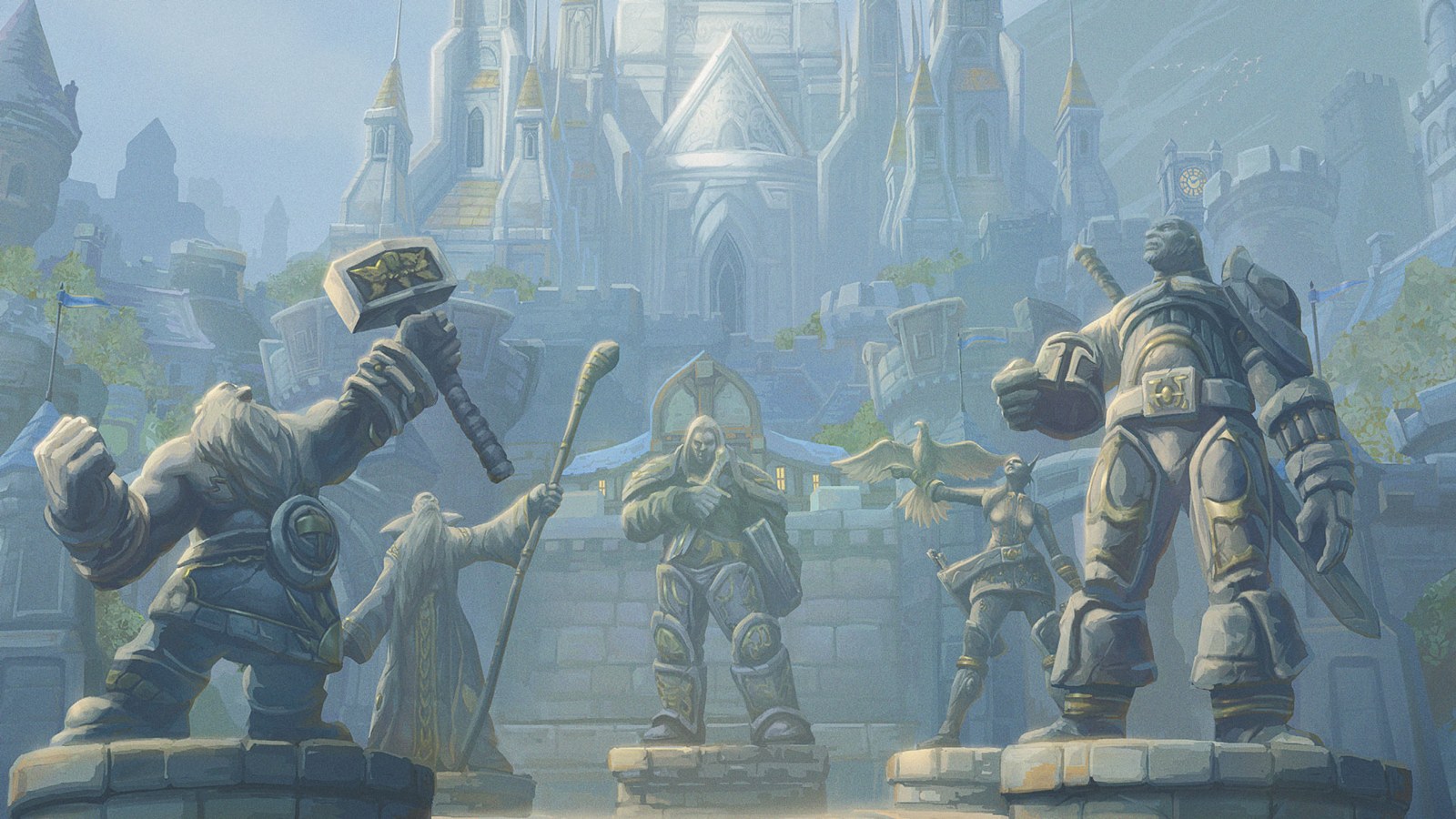
Peter Lee’s Stormwind image is a particularly useful companion. Monumental statues occupy the foreground, with pale towers and blue roofs rising beyond them. The route into the city is more ceremonially framed. Repeated upright forms establish a steady rhythm, while atmosphere softens the distant architecture.
The statues are also a helpful intermediate scale. They are larger than the people near their bases, yet smaller than the city behind them. We climb those steps of size before reading the distant towers.
Put the two images side by side and the difference extends well beyond warm and cool colour. Orgrimmar’s building feels assembled from thrusting, overlapping parts. Stormwind’s approach is organised around weighty stone figures and successive vertical structures. Those are observations about these paintings, rather than rules for how every Horde or Alliance location must look.
Both artists still need somewhere for a visitor to stand. Their foregrounds give us that position, and small figures help bridge the leap to monumental architecture. That shared compositional problem makes the comparison useful to an illustrator designing any pair of cities, even without borrowing Warcraft’s specific motifs.
Bring the environment back to the cover
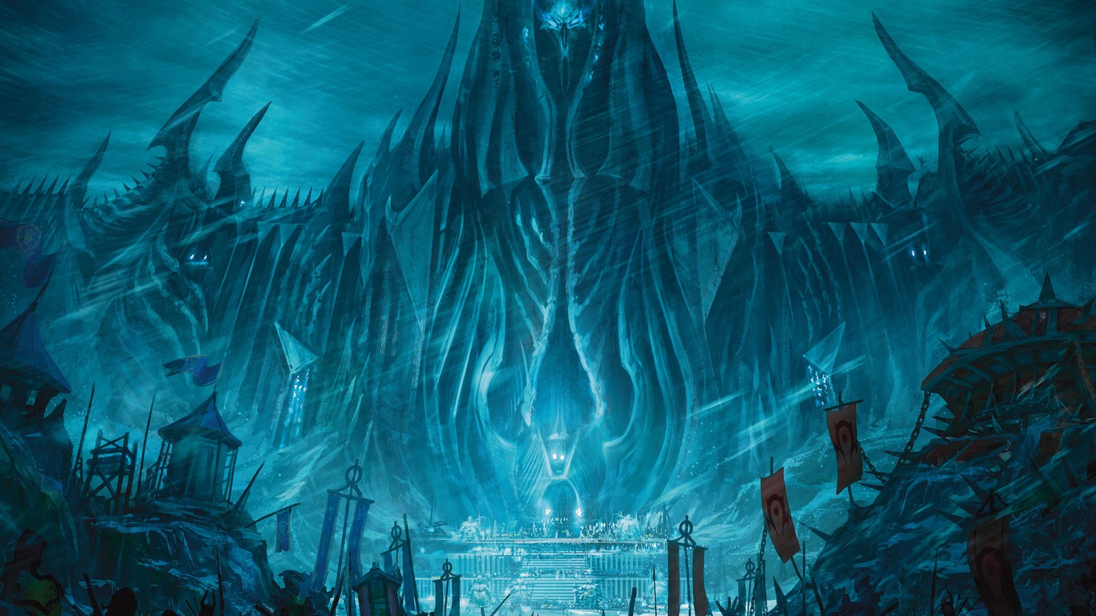
The Northrend painting returns us to the cold, pointed forms of the standard cover. Jagged structures crowd the skyline; the immense central mass rises above a much smaller approach. Repeated verticals make the fortress feel taller, while the blue light binds its separate pieces into a single threatening presence.
D&D Beyond’s regional preview names Bayard Wu and Peter Lee beside their respective images, but credits this one only to “Blizzard artist.” That limitation is retained here. These are published illustrations and promotional examples, not evidence that every image was newly commissioned or that we have access to the artists’ sketches.
Together, the pictures show how an adaptation can preserve visual relationships: people against enormous threats, an approach against a city, a familiar creature against a decorative field. The rendering changes, yet those relationships give the reader a way into the world. For an illustrator, that continuity is more interesting than copying the same armour ornament onto every page.