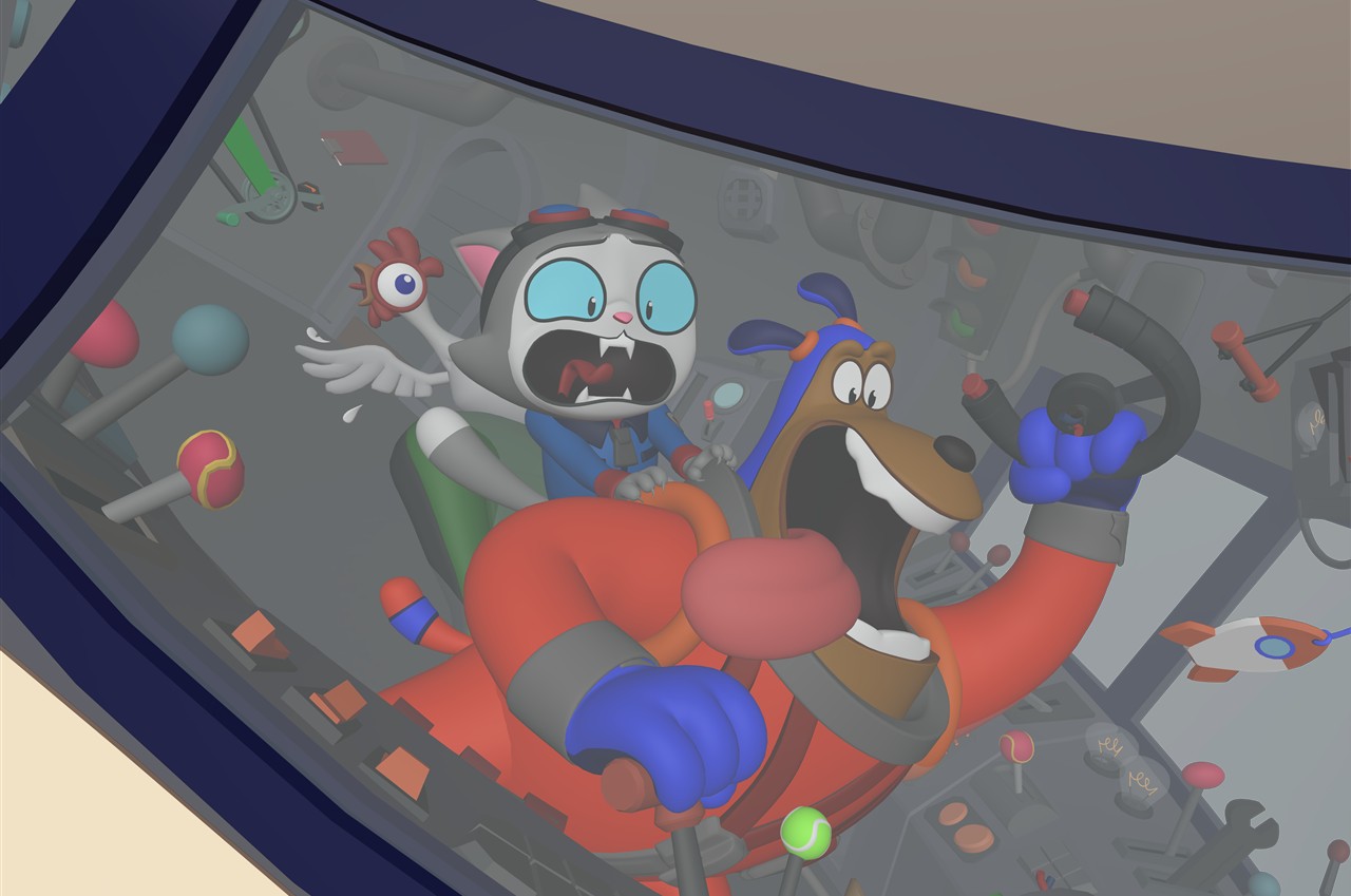
The dog is delighted. The cat is terrified. A steering wheel has broken loose, and the cockpit is packed with things that could get in the way of the joke. The Wing It! poster had to make that situation readable in a single image.
Blender Studio’s short premiered in September 2023. The later production write-ups are valuable because the artists explain the adjustments behind its cartoon appearance. Rik Schutte’s February 2025 poster breakdown and Andy Goralczyk’s lighting account show how much deliberate rearrangement went into images that look spontaneous.
The cockpit was posed too
Schutte describes starting with the characters, then arranging controls and background elements around their silhouettes. The poster needed the cat’s panic and the dog’s excitement to register alongside the broken steering wheel. The cockpit could not be treated as a fixed collection of objects that happened to sit behind them.
The opening image is a production layout. Look at how much information is concentrated in the faces and hands. A lever crossing one of those contours would compete with the action, even if it belonged in a perfectly plausible cockpit. For an illustrator, the useful lesson is the permission to move the background to serve the picture.
The team also combined separate interior and exterior sets, adjusting the exterior towards the poster’s camera. Final corrections continued in Krita, where Vivien Lulkowski added painted elements and refined the rendered result. This was an illustration assembled for a particular view, with painting still part of the finishing process.
The colour script remained a working document
In his lighting breakdown, Goralczyk explains that Vivien’s colour script kept evolving through renders and paintovers. A quick lighting pass could go back to the art department for feedback, then return to lighting for another revision. The painted reference was useful throughout production rather than being left behind after preproduction.
He describes unusually direct control over the characters: their shading could be separated from the environment, with adjustable highlight, shadow and rim colours. Many small objects were excluded from casting shadows to keep the image simple. The purpose was a coherent cartoon picture, even where that meant departing from a physically consistent lighting setup.
The horn shows what a shader can change
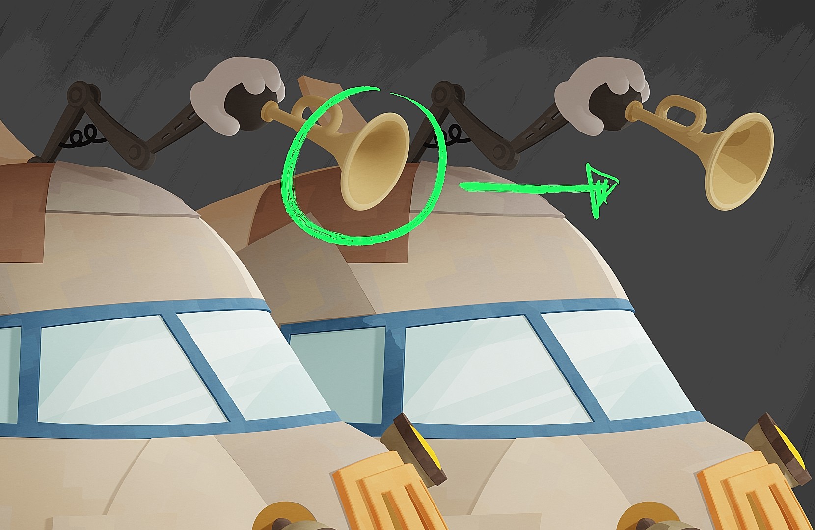
Simon Thommes’s October 2023 shading account provides an unusually clear example on the rocket’s horn. The comparison turns a smooth gradient into patches of colour. He describes changing the surface normals—the directions used to calculate shading—so that selected areas behave as flatter planes. The outline can stay rounded while the interior reads more like a deliberately simplified drawing.
The distinction is easy to miss when looking only at the finished film. In the example, the horn does not need a row of extra drawn edges to explain every change of plane. A few colour shapes establish its opening and the turn of its surface. The small alterations also bring it closer to the angular treatment of the cockpit windows beneath it. The prop and its surroundings begin speaking the same visual language.
Thommes also explains that much of the texture variation in props and environments was concentrated in colour rather than value. This matters to a painter because a textured brush can accidentally add dark marks everywhere. Those marks may suggest material, but they also introduce new shapes competing with the drawing. Keeping texture close in value lets the major light and dark relationships remain in charge.
Neither adjustment is a prescription for flattening every part of an illustration. The horn still needs to read as a hollow object, and the cockpit still needs enough depth to place the characters. The useful observation is more precise: smooth shading is not automatically clearer shading. A deliberate colour boundary can describe a turn more economically than a long gradient.
Seen alongside the poster, this example helps separate two kinds of work. The pose and composition establish the joke; the surface treatment supports it. Refining the second cannot rescue an unclear first. Both deserve attention, but in that order.
Why this matters to a painter
It is tempting to explain this look with outlines or a particular shader. The production accounts point to something broader. Pose, background placement, shadow shapes and colour contrast were all available for revision. If the cat’s expression did not read, there were several ways to help it besides increasing the detail on the cat.
A useful way to study the layout is to follow one contour from the face down to the hand, then inspect the space immediately around it. That small region shows how character and background cooperate. The same test works on a painted illustration, where a distracting edge can be moved in seconds but may go unnoticed for hours.
Read the poster breakdown for the composition stages and the lighting breakdown for the paintover feedback loop. Together they explain the production choices behind the style far better than a finished frame alone.