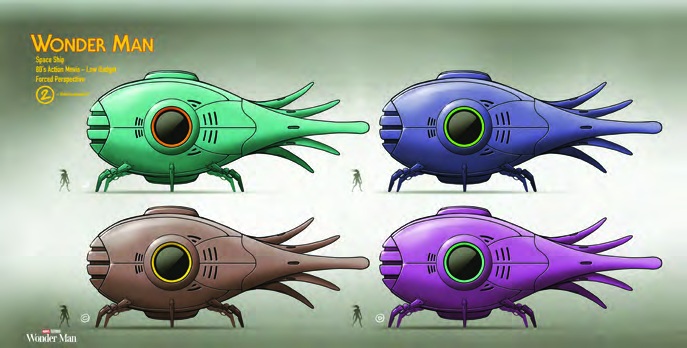
The little spaceship looks as though it might scuttle away. Its body is round and heavy, its legs are thin, and a fan of pointed shapes stretches out behind it. Andrés Parada’s colour studies for Wonder Man give the same creature-like silhouette four personalities. The green version feels very different from the violet one, although almost nothing about the underlying drawing has changed.
These designs appear in A Love Letter to LA, the account by production designers Cindy Chao and Michele Yu in Perspective’s May–June 2026 issue. The report follows the series from everyday apartments to ambitious practical sets. Its spaceship material offers a particularly clear connection between a concept drawing, a camera plan and something a crew could build.
Give the outline enough character to survive a new palette
Start with the large circular window. It anchors the side of the oval body, while the little vents and short horizontal marks describe its surface without breaking that first reading. The tail supplies the opposite rhythm: long, narrow shapes pointing away from the compact hull. The legs add another change of scale underneath.
The four studies hold those relationships steady. Orange surrounds the window on the green ship; lime accents the blue one; yellow interrupts the muted brown; the violet version pushes its bright body against darker edges. Comparing them is easy because the artist has kept the pose, proportions and light broadly consistent. We can judge the colour instead of being distracted by a different drawing.
The profile has a practical question to answer
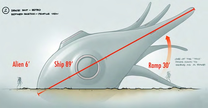
The grey profile makes the body’s weight more apparent. Its blunt front sits low, then the upper surface sweeps back into a series of fins. A red diagonal labels the imagined ship as 89 feet long. A six-foot alien and a 30-foot ramp give that number something to relate to. These are design dimensions; they are not the size of the miniature eventually taken to the location.
The note beside the tail describes one section folding down into a ramp. That changes how we read the spines. At least one has to perform an action as well as make an attractive outline. It also places the exit in a specific relationship to the body. Someone looking at the design can begin to ask where a performer would emerge and how they would reach the ground.
Chao and Yu explain that sea creatures informed Parada’s work and that the ship was nicknamed Tako. The organic outline makes that connection visible without needing scales or a literal animal face. A rounded volume, radiating appendages and a few carefully placed openings carry the idea.
Design the view, not only the object
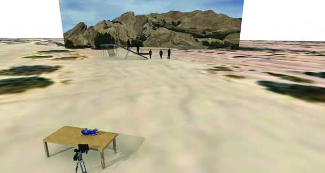
The previs image is almost comically plain beside the paintings. A tiny ship rests on a table close to the camera. Farther away, figures and a ramp stand against a photographic strip of landscape. Yet it explains the essential trick: objects at very different physical distances can meet in the same picture.
The report credits art director Ryan Brett Puckett with the modelling and calculations behind the forced-perspective effect. The miniature’s platform stood 150 feet from the full-size ramp. Alignment let the action connect across that separation. This is a useful reminder that a convincing image may depend on designing a particular camera position, rather than producing an object that works identically from everywhere.
Keep the miniature and the full-size action in the same world
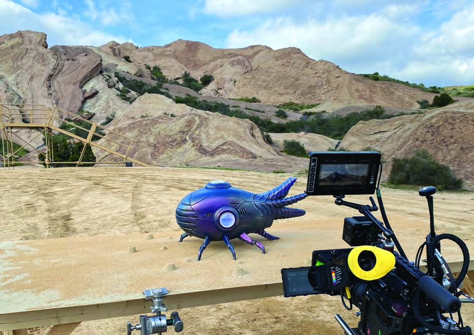
Puckett’s set photograph makes the arrangement tangible. The blue ship occupies the foreground platform; the camera sits beside it; the ramp rises across the rocky ground behind. The monitor shows a much more compressed relationship than the wider photograph. Looking between those two views helps separate the physical setup from the image it creates.
The miniature retains the concept’s round window, ribbed tail and delicate legs. Strong features survive even when the ship becomes a small object surrounded by equipment. Its broad colour areas also keep it readable against the sandy location. The painting’s decisions have practical consequences well beyond the presentation sheet.
The wide photograph also shows how much extra information the crew has to control. The platform edge, camera body and distant railings would immediately give the trick away in the wrong frame. The useful view is a carefully chosen portion of that larger setup. Framing is part of the effect’s design, rather than a final cosmetic crop.
An interior has another job to do
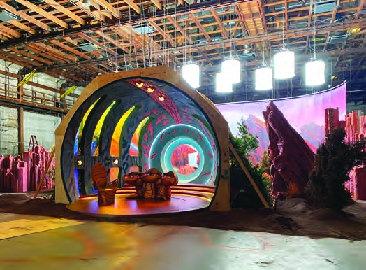
The soundstage interior repeats the circular opening and curved ribs at a scale people can occupy. Coloured patterns run over the inner surfaces; a console supplies a lower cluster of shapes inside the larger shell. Through the opening, the landscape backing continues the world beyond the room. We can recognise the family resemblance while seeing a very different kind of construction.
Later in the report, Katherine Sharpless’s construction drawings explain how the interior separates into repeatable sections for a destructive effects sequence. The designers describe planning both the breakup and the reset. That requirement belongs in the design conversation early: an impressive silhouette still needs a workable route into construction, performance and the next take.