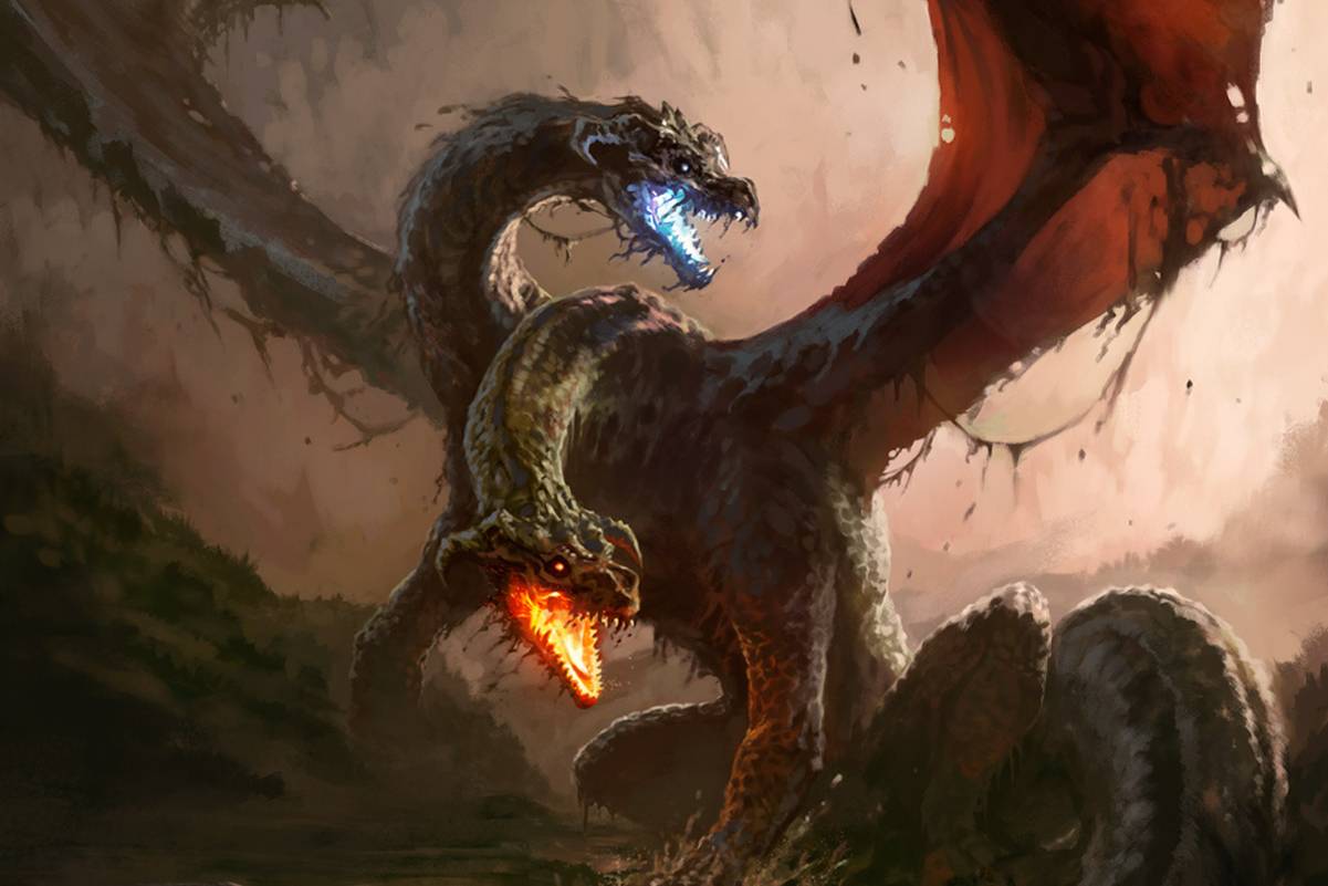
Two mouths light up the same dark body: one blue, one orange. David Astruga’s Dread Linnorm does not need a paragraph of explanation to announce that this encounter will be unpleasant. Across the same release, Irina Nordsol gives a horned traveller a much quieter entrance. Together, the paintings offer two useful ways into a fantasy world.
D&D Beyond published Champions of Ysgard on November 5, 2026. Jay Jani’s announcement credits Astruga with the Dread Linnorm, Firre and Valkyrie illustrations, and Nordsol with the Bariaur. The release includes material for Ysgard and the Upper Planes. These are published illustrations, not a disclosed sequence of concept sketches; the visual readings below are ours, rather than claims about either artist’s intentions or software.
Give each head a separate entrance
A two-headed creature creates an immediate composition problem: the heads can compete or merge. Astruga separates them by height, neck curve and colour. The upper jaw glows blue against a pale opening; the lower jaw burns orange beside a darker area. Both remain visible, but they do not demand attention in exactly the same way.
The necks turn around each other without becoming a symmetrical emblem. One rises in an arch, while the other bends forward and down. That difference makes the threat feel mobile. The viewer can follow each head back into the shared mass, rather than having to untangle a pile of identical limbs.
Notice how little of the surrounding landscape receives comparable contrast. The jaws stay crisp and bright while distant forms soften. The enormous body is readable without every scale being equally sharp. This is a useful distinction when painting monsters: describing a surface thoroughly can weaken the hierarchy that makes the creature intelligible.
A traveller has somewhere to put things
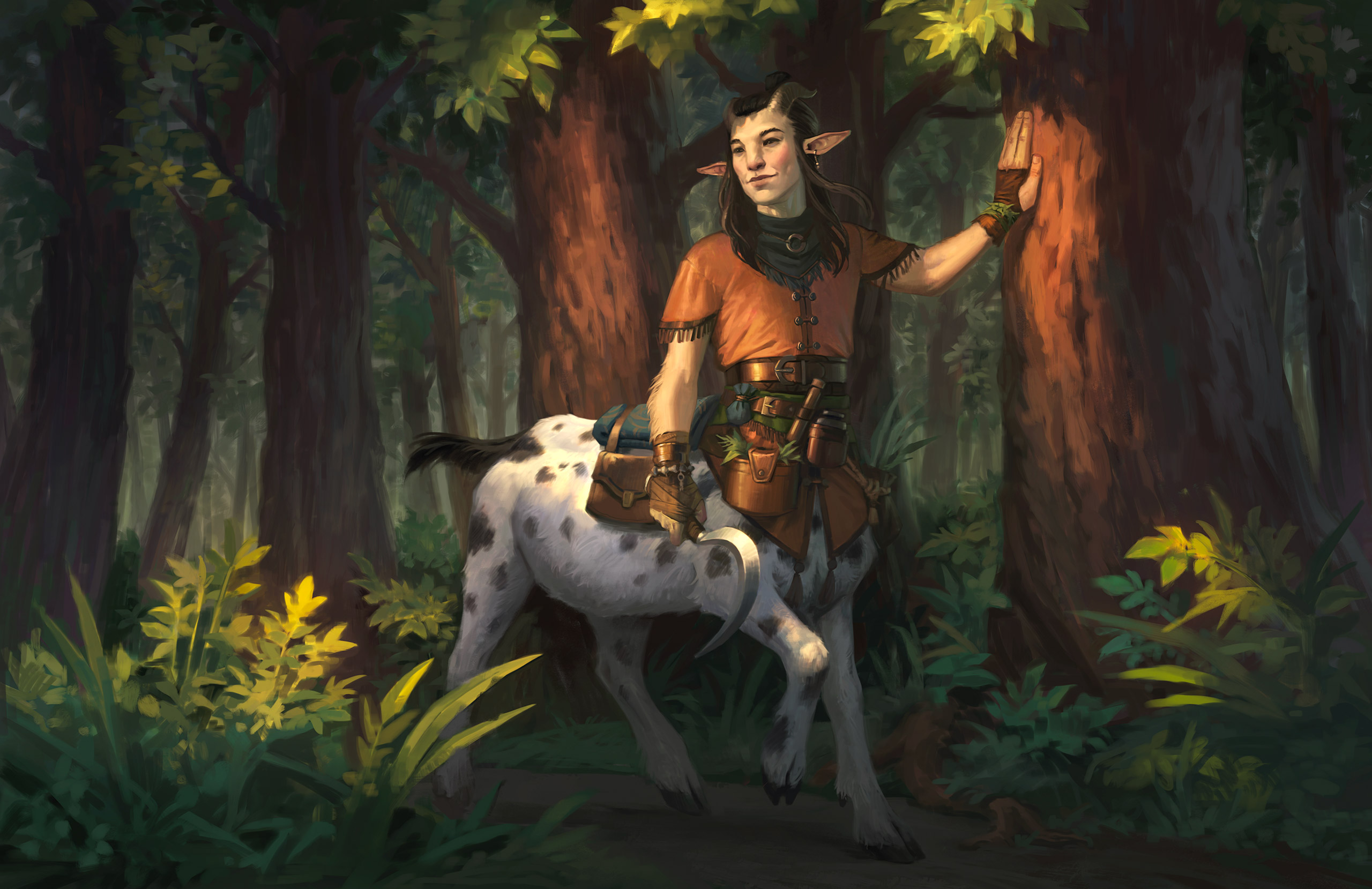
Nordsol’s Bariaur works through a different kind of information. The figure has horns, pointed ears and a four-legged lower body, but the bags, buckles and rolled bundle make the unfamiliar anatomy feel inhabited. Equipment has been fitted around the body instead of floating beside it as a collection of accessories.
The hand against the tree matters too. It creates a simple relationship between character and setting: this person can lean, pause and occupy the path. Warm clothing and skin stand out against the green forest; lighter patches on the flank carry that visibility into the lower half of the silhouette.
The curved blade hangs low, while the face looks away from us. Those choices leave space for a moment between actions. The illustration presents a person who could have a conversation, rather than reducing the character to an anatomical novelty or an attack pose.
The frame changes what we learn
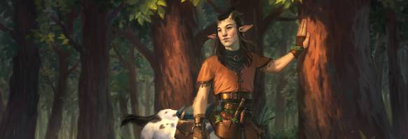
The publisher’s wide promotional crop is a useful comparison. It keeps the face, clothing and tree contact while removing much of the lower body. The full painting explains the character’s physical construction; the narrow version behaves more like an invitation to meet them. Neither frame supplies exactly the same information.
That is worth considering before calling an illustration finished. A portfolio page, a card and a thumbnail may all use one painting, but a crop can remove the feature that makes a design distinct. Check the delivery formats while the composition is still flexible. Repositioning a figure early is easier than discovering that its defining anatomy disappears in every promotional slot.
Design the encounter, then the details
There is also a difference between making an image readable and making every part of it equally obvious. An illustration can leave something for a second look. What matters is that the withheld information does not prevent the first reading from working. In a character painting, small possessions can reward attention after the pose has established the mood. In a creature painting, the viewer needs to understand where the danger is coming from.
For a personal creature project, I would begin with two questions: what must a viewer understand immediately, and what should they discover later? The first answer might be danger, scale or the direction of movement. The second might be occupation, habits or the practical arrangement of clothing. Those answers call for different kinds of drawing.
A readable silhouette is valuable, but it is not the whole assignment. A creature also needs a relationship to the world around it. Light can separate a threatening head; contact with a tree can explain a quiet pause. Try evaluating those relationships before adding another layer of texture. The question is whether the next detail tells us something we could not already see.
The original announcement links the wider release, including maps credited to Mike Schley. Some linked game content requires a subscription. For an illustration study, the two public paintings already provide a focused comparison: spectacle built around opposing heads, and character built through gesture and possessions. Their differences are precisely what makes looking at them together worthwhile.