A face made of green slime is a fairly ordinary starting point for High on Life 2. Giving it three eyes, stretching it along a skateboard and making those eyes carry an Xbox mark is where the design problem becomes interesting. The joke still has to read.
Squanch Games’ September 17 ArtStation Art Blast is a good doorway into this work. It credits concept artists Sean Monaghan, Jeremy Fenske, Mikey Spano and Dan LuVisi alongside character, environment, effects and animation teams. This is a look back at published production work, not a claim that the game or gallery appeared this week.
Make the odd detail belong to a place
In the Art Blast introduction, Spano describes a city with a functioning cinema, licensed films, a comedy club and other optional diversions. He presents those details as the result of artists and developers pursuing ideas they cared about. They give the player reasons to inspect a location beyond the next combat objective.
For a concept artist, that suggests a more demanding brief than “draw something weird.” A cinema needs an entrance, a lobby and somewhere to sit. A comedy venue needs to organise attention around a performer. The familiar activity gives the strange setting a structure. Without that structure, an alien city risks becoming a collection of unrelated props.
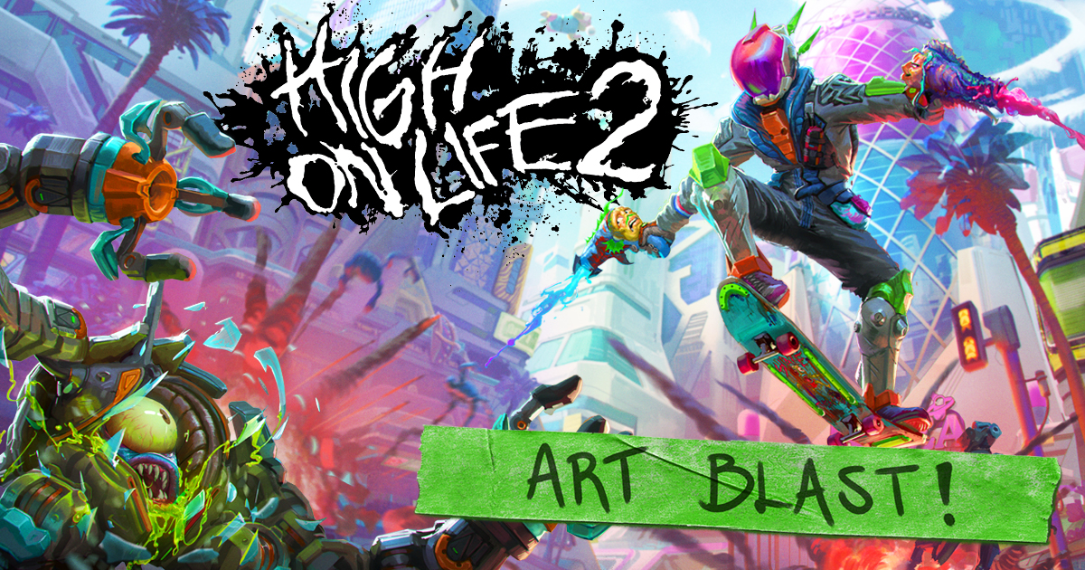
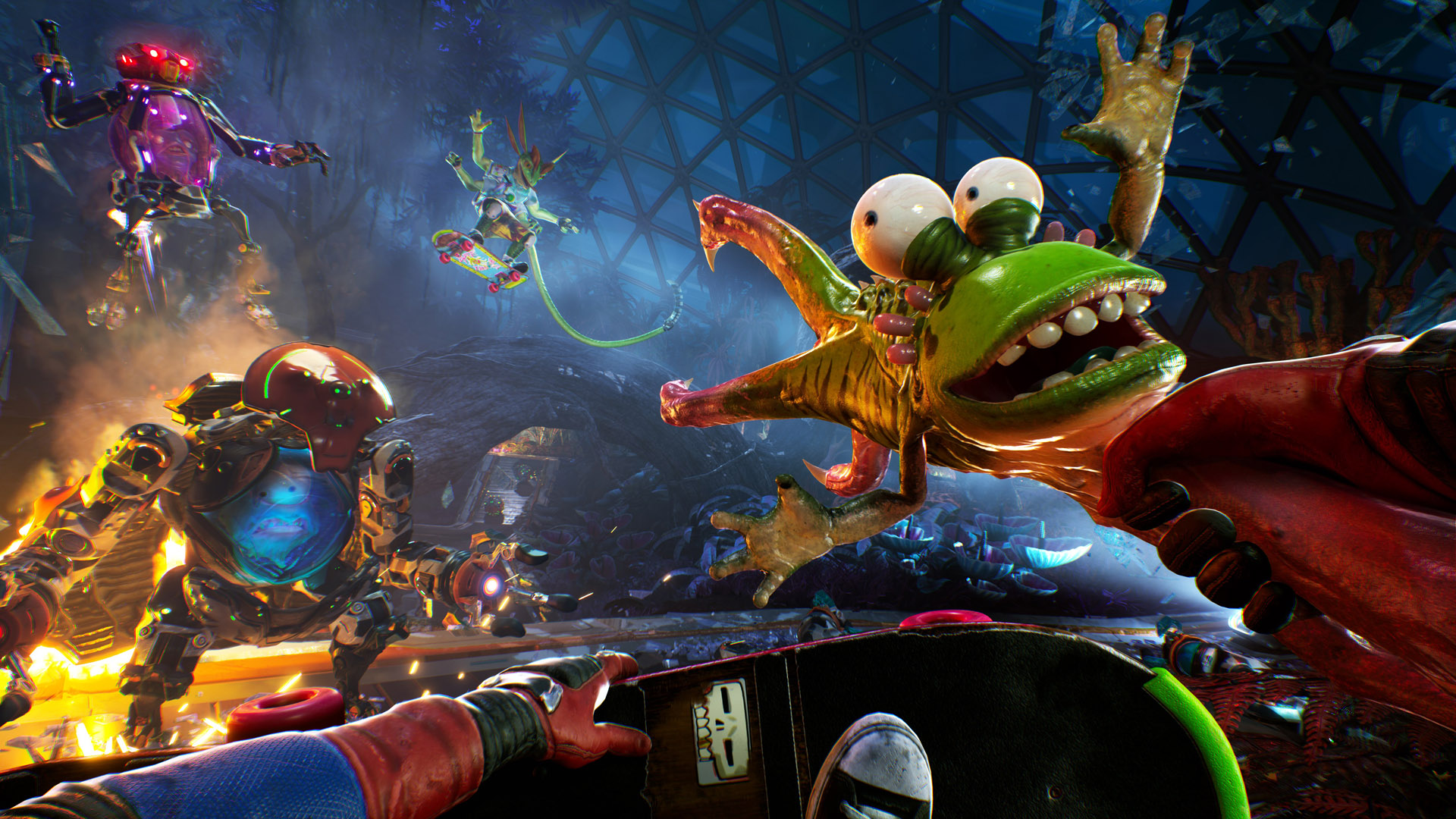
The promotional image above makes that tension visible. Bright organic weapons sit against angular city architecture; a skateboard connects the figure to a recognisable physical action. There is a lot of colour, but the pose gives the composition a direction. Its bent legs and spread arms make the action readable before the smaller surfaces register.
A small design with a very clear constraint
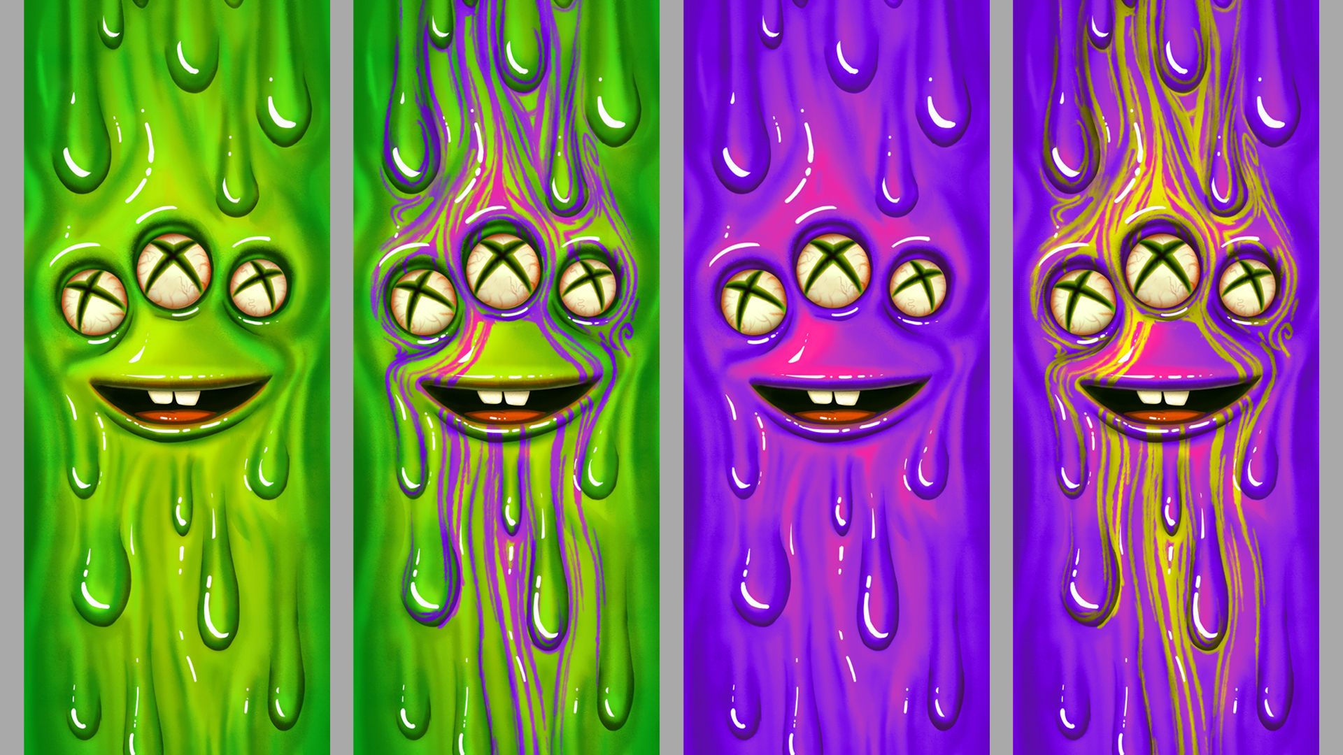
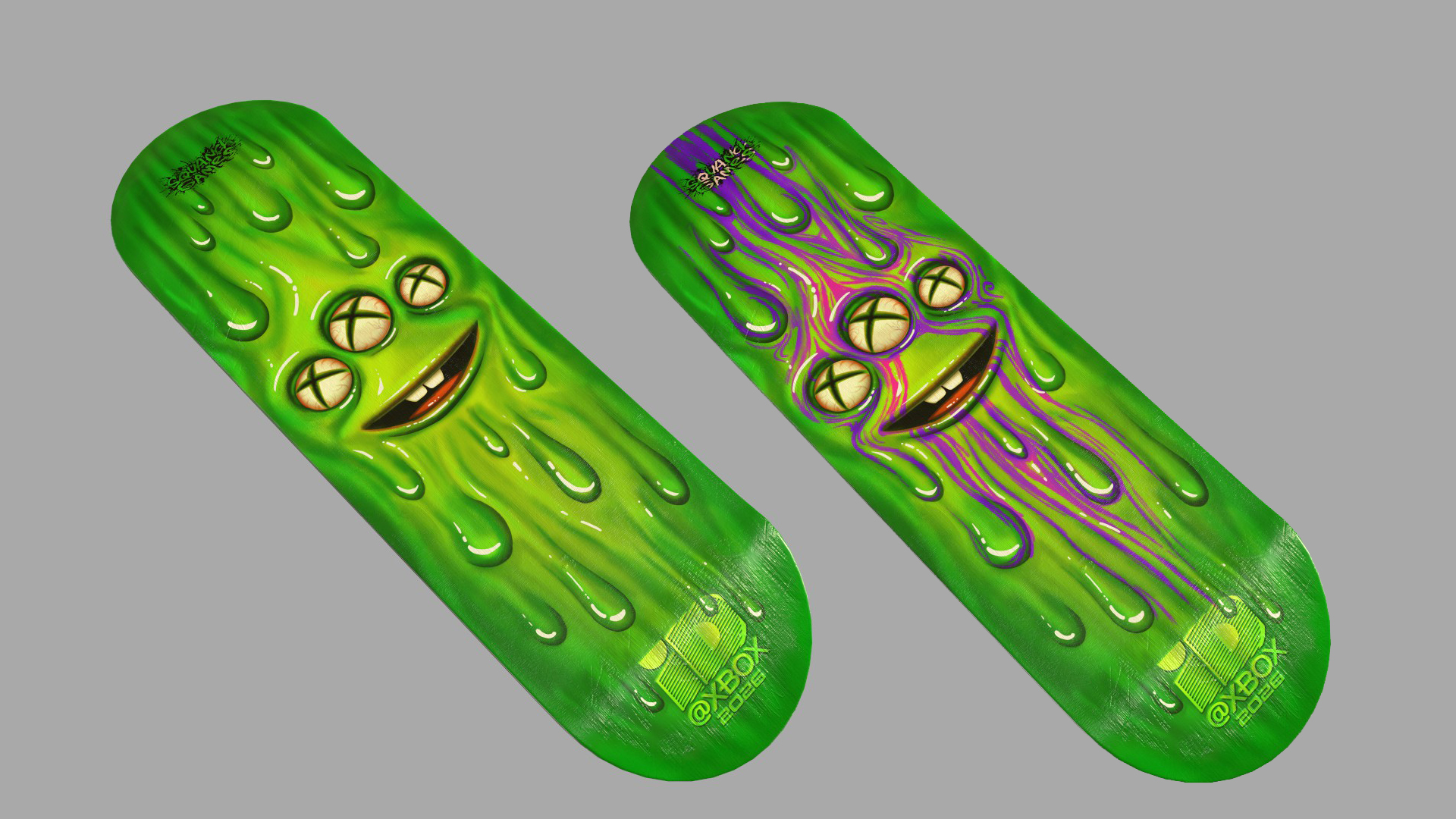
The March 17 Xbox Wire interview with art manager Justin Mohlman supplies a concrete example. The team developed a promotional skate deck around a three-eyed alien in slime. Mohlman connects its saturated colours and grotesque humour to the game’s tone and 1990s skate graphics. Fenske developed colour variations and incorporated the Xbox X into the eyes.
Look at the variations as compositions. The face occupies a compact area, leaving the dripping forms to extend along the board. The mouth is a simple dark opening; teeth and eyeballs provide small light shapes. That arrangement survives both the green and purple versions because the underlying facial pattern stays intact.
The patterned alternatives introduce a useful trade-off. Their acid-coloured streaks make the surface more restless, but they also compete with the eyes. The quieter version gives the face more immediate impact. Neither observation establishes which version is “correct”; it explains what changes when the same silhouette receives a different surface treatment.
The two front teeth deserve a second look. They make the enormous grin feel foolish rather than simply predatory. The heavy upper lip and rounded eyes reinforce that expression, even though the streaks and wet highlights suggest something unpleasant to touch. It is an economical combination of attraction and disgust. The rendering supplies a material, while the proportions supply the joke; adding more texture alone would not create the same character.
Those white highlights also vary in size: long curved marks follow the larger drips, while tiny dots punctuate the face. Repeating one highlight shape everywhere would make the slime look stamped rather than stretched.
The environment has to work at skating speed
An earlier Xbox Wire interview with chief design officer Erich Meyr traces the skateboard idea to Sean McNally’s drawing of the bounty hunter riding a roly-poly-like alien during the first game’s development. The sequel used an ordinary skateboard to connect the player character with Earth.
Meyr describes a practical consequence: allowing players to look anywhere while skating required larger, emptier combat spaces. The team instead tied skating direction to the view, while retaining free looking during grinds. He also recalls a large octopus mascot being adapted for grinding, with an exposed brain used as a bounce surface.
That mascot is a useful example of design doing two jobs. An absurd city landmark becomes a route through the city. From an environment-art perspective, the challenge is making the usable shape readable without stripping away its personality. A successful prop invites a specific action while still looking like something its fictional inhabitants would recognise.
Follow the credits, not just the style
The Art Blast is most useful when treated as a map to individual portfolios. Its character section names Kathleen Muylle, Robert Fink, Ashley Stegon and Jonathon Frederick; its environment section identifies Garrett Brown, Carlos Rizo, Tyler Reed, Colby Wahl and Brooke Routh. The finished look belongs to a collaboration, and individual pages are the place to establish who made a particular asset.
What makes these examples worth studying is the discipline underneath the excess. The slime face respects a narrow format. The city accommodates movement. The artwork establishes a visual joke quickly enough for someone to recognise it while playing. Weirdness gives a design its invitation; clear shapes and purposeful placement let people actually use it.