A new toolbar rarely makes a painting better. It can, however, make choosing a tool less distracting. That is the useful way to approach Photoshop’s refreshed interface: look for small interruptions it removes from an actual painting session, rather than judging it only as a new coat of paint.
Adobe’s October announcement describes a first phase covering the toolbar, tool options and selected panels. This remains a beta preview as of this article’s November 4 check. The announcement carries an October 15 timestamp while its availability note names an October 6 build; neither should be mistaken for a confirmed general-release date.
Colours you just used are easier to revisit
One announced change brings recently used colour swatches into the Color Picker, shared with the Swatches panel. For a painter repeatedly returning to a few chosen colours, that could shorten the trip between mixing a colour and recovering an earlier one. Whether it feels quicker will depend on your palette and habits.
There is a useful distinction here. Adobe’s Swatches documentation describes saved colours and project-specific groups, while the Color panel is intended for interactive mixing. A recent-colour history records what happened during a session. A deliberately saved palette records what you want to keep using. Those jobs overlap, but they are not interchangeable.
Imagine painting a room with cool daylight and a warm lamp. You might want to recover the exact lamp colour after experimenting with several background mixtures. Recent colours are useful for that short return. For a second illustration in the same room, a named group of saved swatches is a more dependable reference than whatever colours happen to remain in the history.
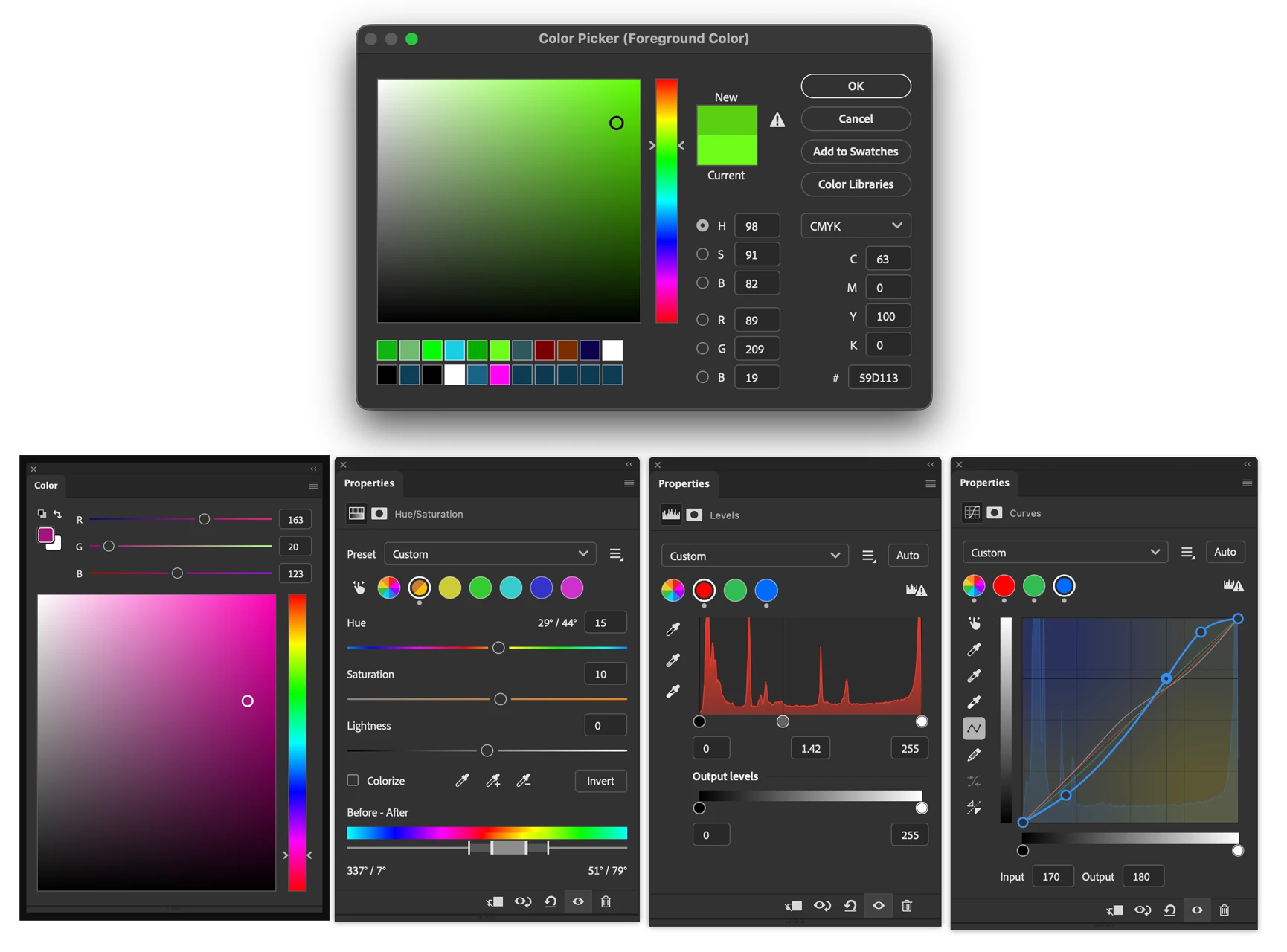
The preview still places numeric values beside the large colour field. That matters when a loose colour study becomes a production reference: you can explore by eye, then record a specific choice for another image.
Judge tool visibility at your actual working scale
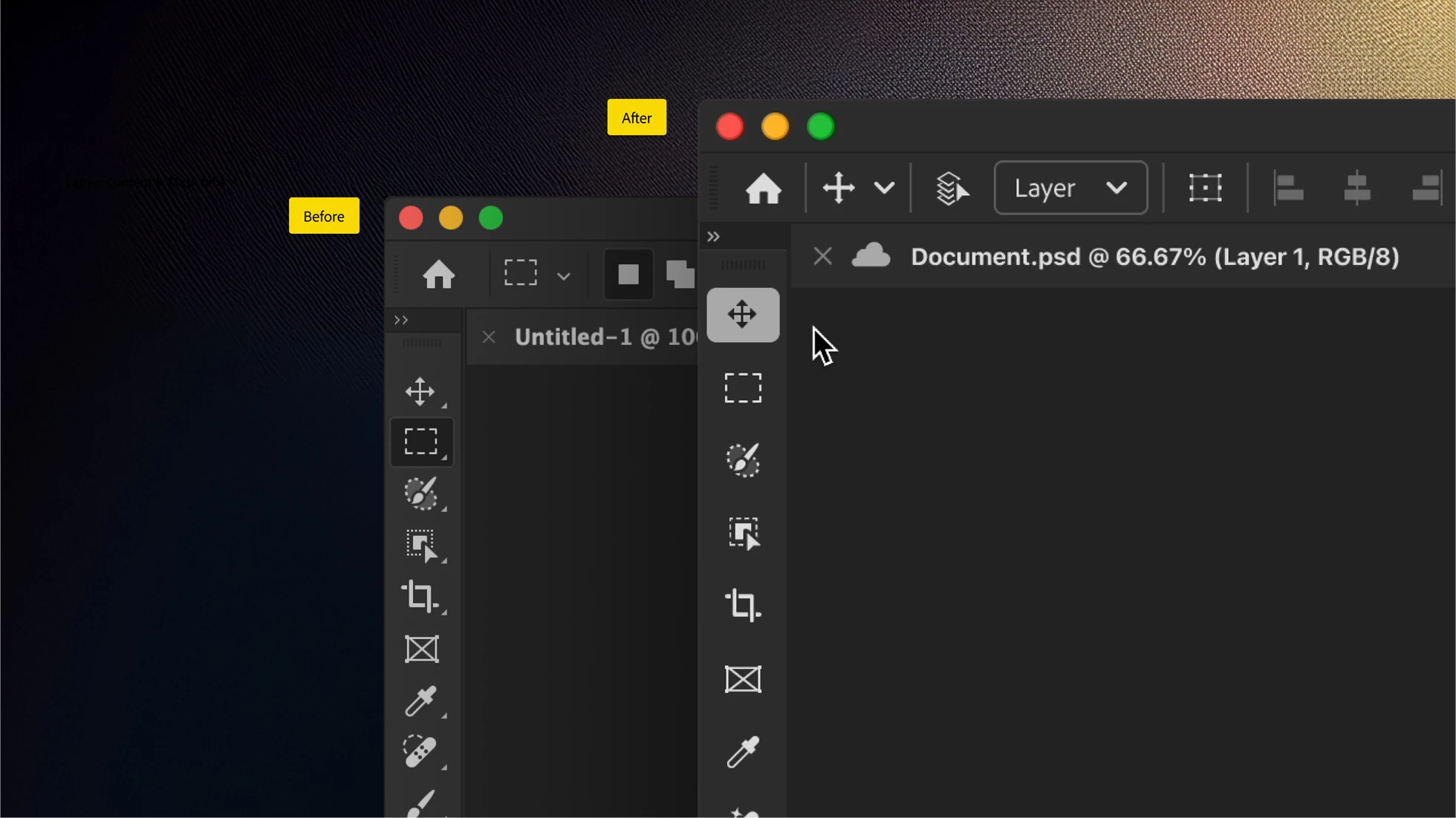
Adobe also describes stronger selected-tool contrast and grouped tools that become available on hover. The comparison image shows a lighter selected-tool background and revised spacing. These are changes to access and feedback; the announcement does not establish a new brush engine or a different way of calculating paint strokes.
On a pen display, the practical question is whether you can identify the active tool without leaning toward the screen. A large promotional screenshot cannot answer that. Test the interface at the display scaling you normally use, with the canvas at a comfortable size and the panels where you keep them. Small interface changes can feel different when your hand is covering part of the display.
The same applies to hover behaviour. If you mostly use keyboard shortcuts, you may rarely need it. If you teach beginners or frequently switch within a tool group, discoverability matters more. Watch for accidental openings as well as faster access. Both observations are more useful feedback than simply preferring the old or new icons.
Try that comparison with the Brush and Eraser, too. A selected-state indicator earns its space when it prevents one mistaken stroke, especially after a pause away from the canvas.
The colour controls still need a clear purpose
Jan Kabili’s Adobe lesson on choosing colours explains the roles of the Color Picker, Eyedropper, Swatches and Color panel. The picker offers explicit colour values; the Eyedropper retrieves colour already in an image; saved swatches help repeat a choice. That remains a useful framework for judging the refresh. A clearer control should help you make the same intentional choice with less searching.
In the published panel preview, Hue/Saturation uses coloured circles and range controls, while Levels and Curves retain their graphs. Read those alongside the image you are adjusting. A pleasing panel arrangement is not evidence that an adjustment is less destructive or that it produces a better result. The layer structure and the decisions made with it still matter.
For a fair comparison, use a copy of one familiar painting. Recover a previously used colour, select a grouped tool, and make a modest adjustment that you can turn off again. Note where you hesitate and where you no longer need to hunt. Keeping the subject and tasks familiar makes it easier to notice the interface rather than changes in your own drawing.
Keep the beta separate from a deadline
Adobe’s Creative Cloud beta FAQ says beta applications install separately from release versions and keep separate preferences. You can therefore evaluate Photoshop Beta alongside your normal installation. Separate preferences also mean that an unfamiliar workspace is not necessarily evidence that a favourite setting has been removed.
This preview is based on Adobe’s published announcement and images, not a claim that we have stress-tested every painting workflow. The most convincing improvement will be the one you stop noticing: a colour recovered immediately, a selected tool that is obvious, or a control you can read without breaking concentration. That is the standard worth bringing to the beta, and the sort of specific feedback that can help shape the next iteration.